PonceDesign Let's talk
All work

Seismic  ·  2021

Approval Workflow

Seismic's banks, insurers and asset managers wanted sellers to personalize content, but nothing personalized could reach a buyer without a compliance check. I led the design of distribution approval workflows: a seller submits an email or link, compliance reviews it step by step, and everyone can see who has it, what changed and what happens next. 73% of task ratings in testing came back easy or very easy.

Client

Seismic

Timeline

Aug 2020 – Jan 2022

Role

Lead Product Designer

Team

Product manager, workflow and front-end (Mantle) engineers, QA

Product area

Seismic Engagement · Admin · Compliance

Focus

Enterprise · Product UX · Design Systems
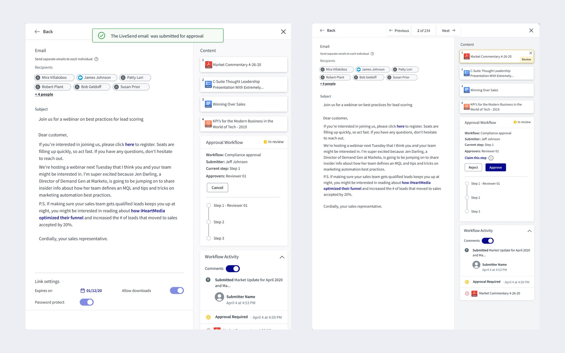
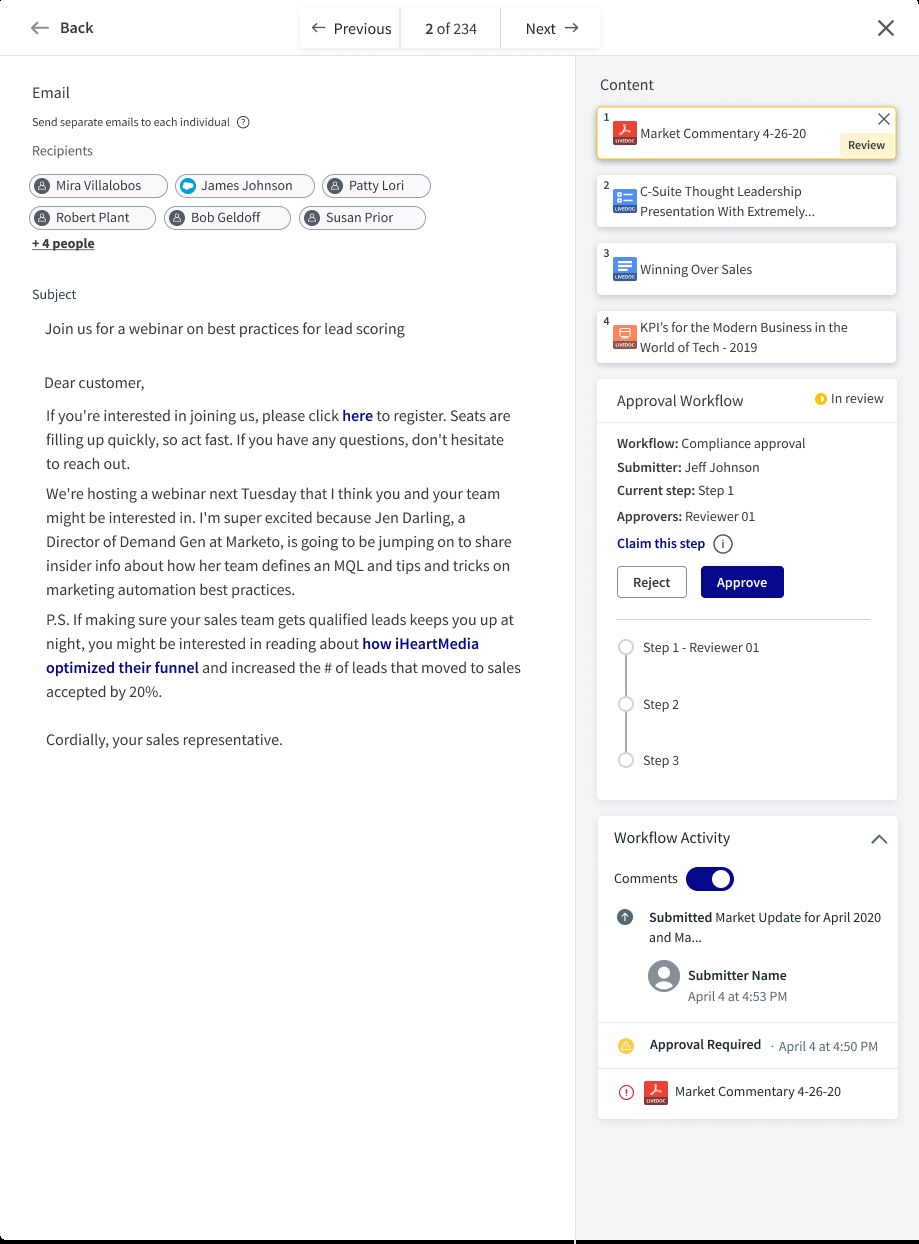
Two views of the same LiveSend email. On the left, the seller's view after submitting: a banner reads The LiveSend email was submitted for approval, and an Approval Workflow panel shows the status In review, the workflow, submitter, current step and approver, with a Cancel button and a three-step tracker. On the right, the compliance reviewer's view of the same email, with Previous and Next controls (2 of 234), a Review flag on one piece of content, a Claim this step link, and Reject and Approve buttons

In one line

Sellers could already send content to buyers as a tracked link, an email blast or a print order. For regulated firms, that was the problem: a personalized email reached a buyer before anyone in compliance saw it. I designed distribution approval workflows: rules an admin sets up, a submission flow for sellers, a review flow and dashboard for compliance, and one status panel that all three share.

73%Of task ratings were easy or very easy, from 10 unmoderated UserTesting participants
3Ways to send content that now pass through approval: LiveSend link, Email Blast and Print Order
5Release milestones, M2 to M6, delivered between October 2021 and January 2022

Context and the problem

Seismic is a sales enablement platform. Content managers publish approved decks and documents, and sellers share them with buyers. Publishing already had an approval workflow. Distribution didn't. Once a seller picked the recipients, wrote the email and chose what to send, it went out.

For financial services customers that was a blocker. Every personalized email is a financial promotion, and a regulator expects a compliance team to have approved it. Two problems followed:

  • Compliance had no way to govern an engagement before it was sent: the recipients, the email template, the content and the distribution method.
  • Nobody could see where approvals stood. Compliance and sales teams needed one view of every engagement waiting for review, so they could act on it.
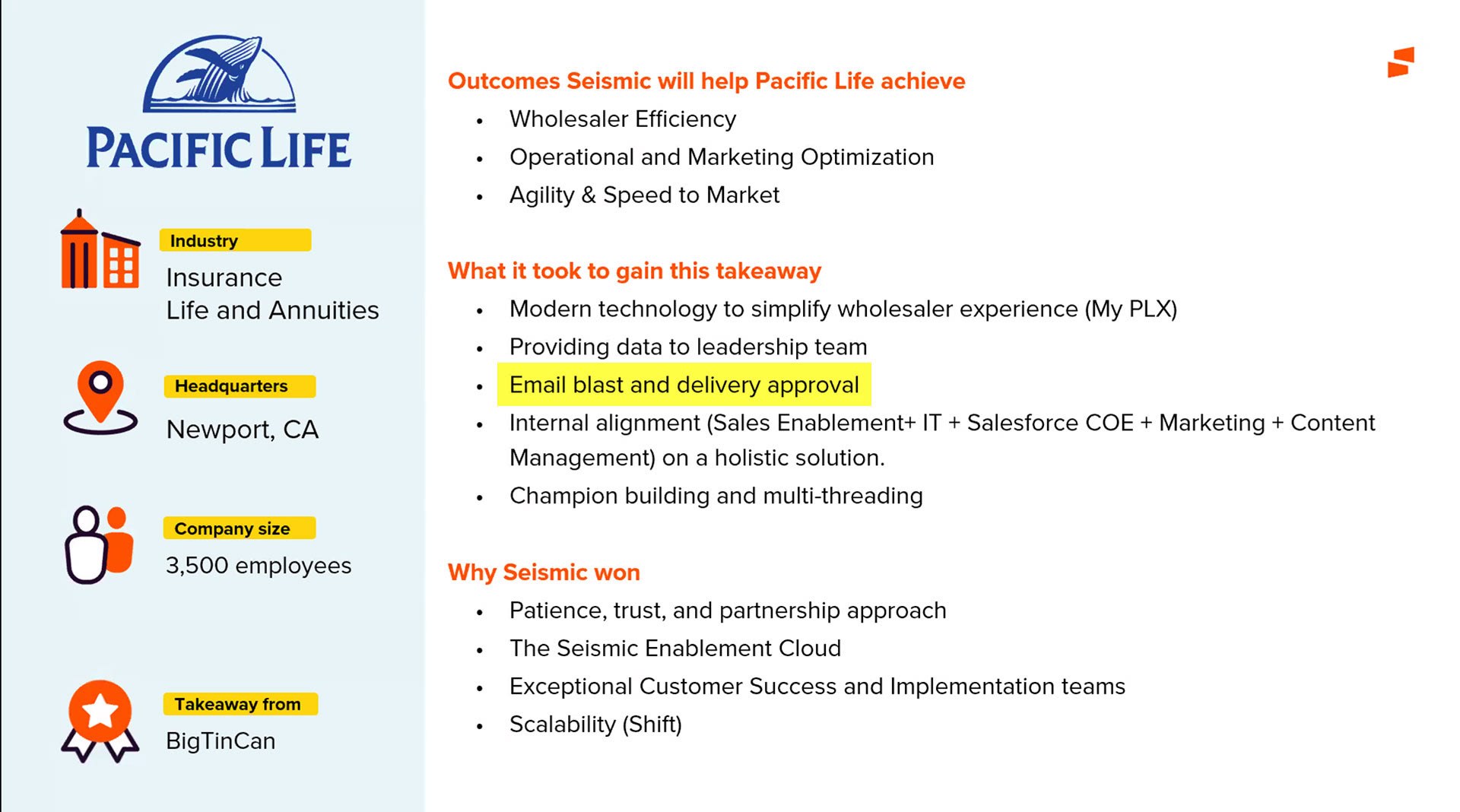
Seismic customer win slide for Pacific Life, an insurance, life and annuities company in Newport, California with 3,500 employees, taken from BigTinCan. Under What it took to gain this takeaway, the line Email blast and delivery approval is highlighted, alongside modern technology for wholesalers, data for leadership, internal alignment and champion building
Why it mattered commercially. When Seismic won Pacific Life from a competitor, email blast and delivery approval was on the short list of what it took.
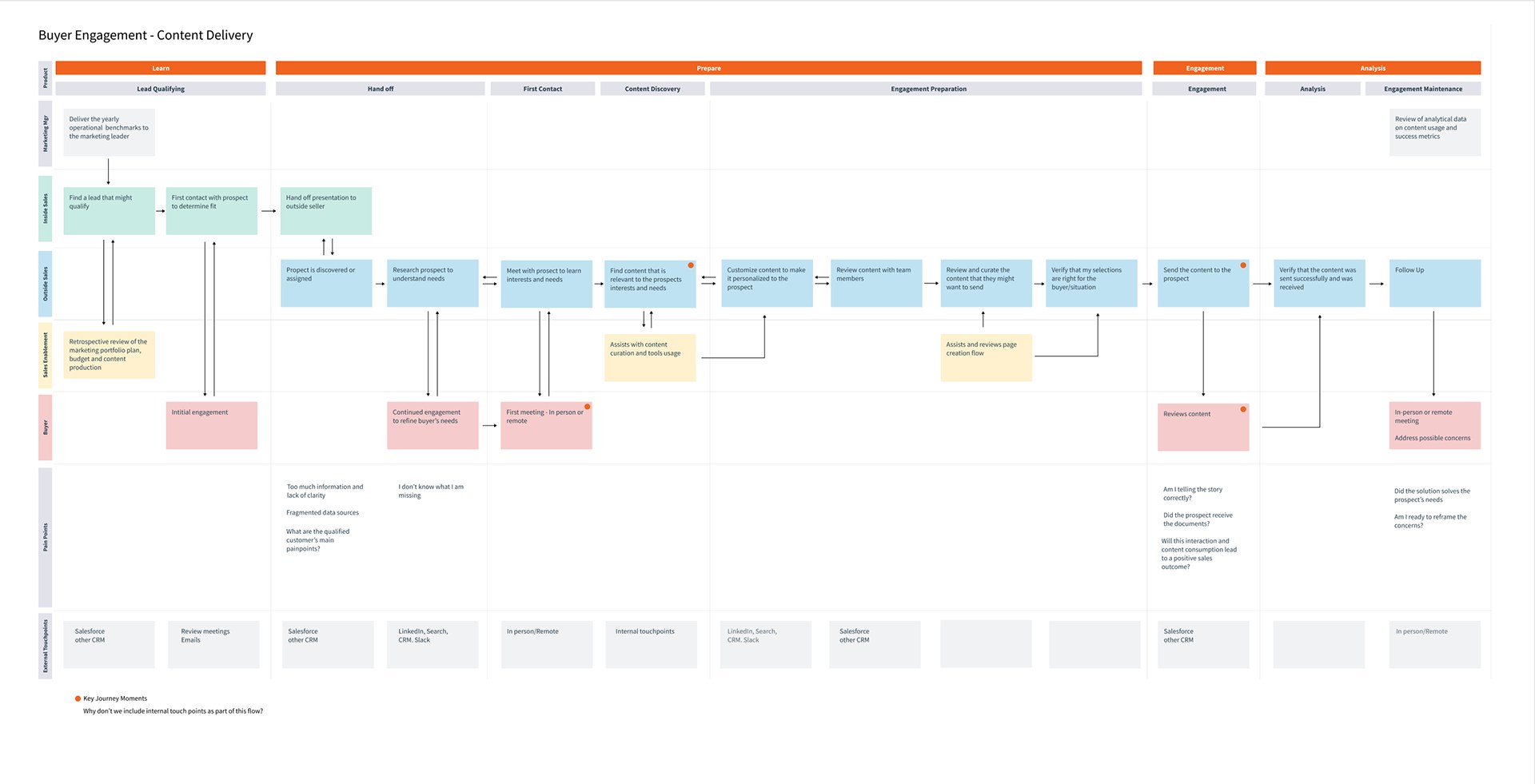
Service blueprint titled Buyer Engagement, Content Delivery, with swimlanes for the marketing manager, inside sales, outside sales, sales enablement and the buyer, across the phases learn, prepare, engagement and analysis. Key journey moments are marked at finding relevant content, sending the content and the buyer reviewing it. Pain points include too much information and lack of clarity, fragmented data sources, and am I telling the story correctly
The seller's journey from lead to follow-up. Approval had to fit into the short gap between verify my selections and send the content without turning it into a wait nobody could see.

The constraints:

  • Contract commitments. Approval workflows were already promised to existing customers, so scope and dates were partly set before design started.
  • Two workflow systems. Publishing approval already existed, with its own states and admin settings. Distribution approval had to work next to it without confusing admins who used both.
  • Profile rules. Publishing profiles could hide some distribution methods from some users, so the workflow couldn't assume every seller could send every way.
  • A new design system mid-project. Seismic moved to the Mantle style guide during the work, so the high-fidelity screens were rebuilt on new components.

My role and what I owned

I was the lead product designer on approval workflows, from the first client interviews to visual QA in the dev environment.

  • I owned the client and stakeholder interviews and their notes, the state and lifecycle models, the admin settings design, the page flow and dashboard navigation, the prototypes and the UserTesting study, the high-fidelity screens for sellers and reviewers, the responsive layouts, and the visual QA log with engineering.
  • Product management owned requirements, the roadmap and the client commitments, and joined the design reviews with customers.
  • Engineering built the workflow engine and triggers. The Mantle front-end team built the shared list view (datagrid) the dashboard sits on. QA wrote the integration test cases for each milestone.
A note on the images

The figures are working boards, prototypes, test slides and final screens. People, companies and content in the mockups are placeholder data. I've blurred colleagues' names on four boards, and left out internal meeting notes, customer emails and dev-environment screenshots because they name individuals.

Goals, and how we'd know

We agreed on what success meant before designing screens:

  • Personalize and still comply. A seller can customize an email or link and submit it for approval without leaving the share flow. Tested with task completion and ease ratings.
  • One place to act. A compliance reviewer can find everything waiting for them, open it and approve or reject it from a single dashboard.
  • Status anyone can read. At any moment the seller and the reviewer can tell who has an engagement, which step it's on and what changed. Tested as states and flows clarity.
  • Contracts met. For the business, success meant delivering the approval capability already promised to customers, in a form that Core customers could use too, not only Financial Services.

What we learned in research

Between August 2020 and January 2021 I ran design reviews and interviews with clients including Credit Suisse, IBM, FleetCor and 361 Capital, and with Seismic's customer specialists. I also ran a competitive review with business experts. IBM alone had 18,000 Seismic users and 1,400 content managers, so whatever we built had to hold up at that scale.
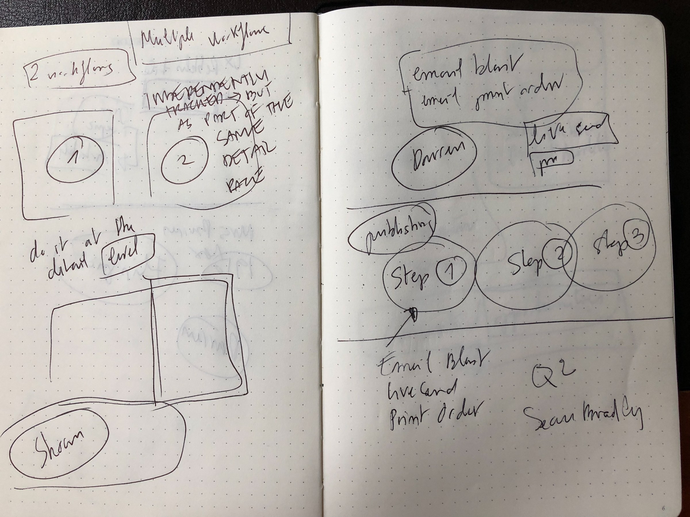
Notebook spread of early sketches: two workflows tracked independently but shown on the same detail page, a note to do it at the detail level, and a three-step chain labeled publishing with Email Blast, LiveSend and Print Order as the things that trigger it
Interview notes turned into sketches. Two workflows tracked separately but as part of the same detail page, and Email Blast, LiveSend and Print Order as the three triggers.

1. The workflows were built around content, not people

In the existing product, a workflow lived in a drawer on a document. To find what needed your review you drilled through folders, and nothing told you what was waiting for you. The settings and drawers didn't update as a workflow moved. So we designed around the reviewer, with a dashboard of engagements waiting for approval and a clean flow from notification to decision.
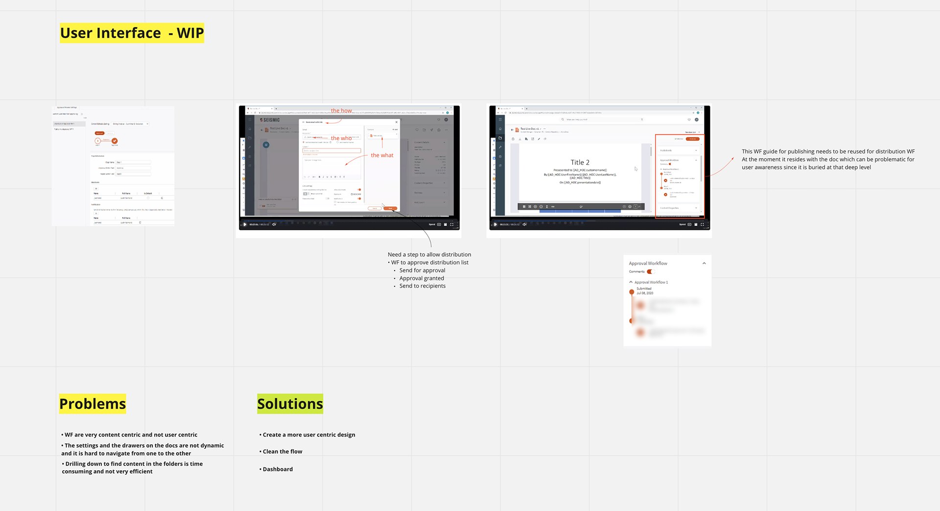
Working board titled User Interface WIP. Annotated screenshots of the existing share dialog are marked the how, the who and the what, with a note that a step is needed to approve the distribution list: send for approval, approval granted, send to recipients. A second screenshot highlights the approval workflow widget inside a document, with a note that the publishing workflow guide should be reused for distribution but is buried too deep for user awareness. Below, Problems: workflows are very content centric and not user centric; settings and drawers are not dynamic; drilling down to find content in folders is time consuming. Solutions: create a more user centric design, clean the flow, dashboard
The audit that set the direction. The share dialog already held the how, the who and the what, so it was the natural place to submit from. Status was buried in a document drawer. Problems on the left, solutions on the right.

2. Group review needs a claim

Credit Suisse and IBM both route reviews to a group, not a person. Two reviewers could open the same email at once, or nobody could, and assume someone else had it. They asked for approval claims and notification reminders. So claiming became part of the model: a reviewer claims a step, the others in the group are told, and admins can set reminders when nobody acts.

3. Mistakes are expensive to undo

In the IBM interview, the first pain point was that when a seller made a mistake with a distribution, it was hard to recover from. So rejection became a loop, not a dead end: a reviewer rejects with a comment and flags the content at fault, the seller fixes it in the same view and resubmits, and the history keeps both versions.

Strategy and the decisions that mattered

Decision 1: One state model for publishing and distribution

Admins would configure both workflows, and some reviewers would work in both. Two different sets of statuses would have meant two things to learn. I mapped the publishing and compliance workflows side by side and kept the states the same (Draft, In review, Approved, Rejected, Reissued, Scheduled, Expired) where they meant the same thing. They differ only at the end: publishing ends in Published, distribution ends in Sent.
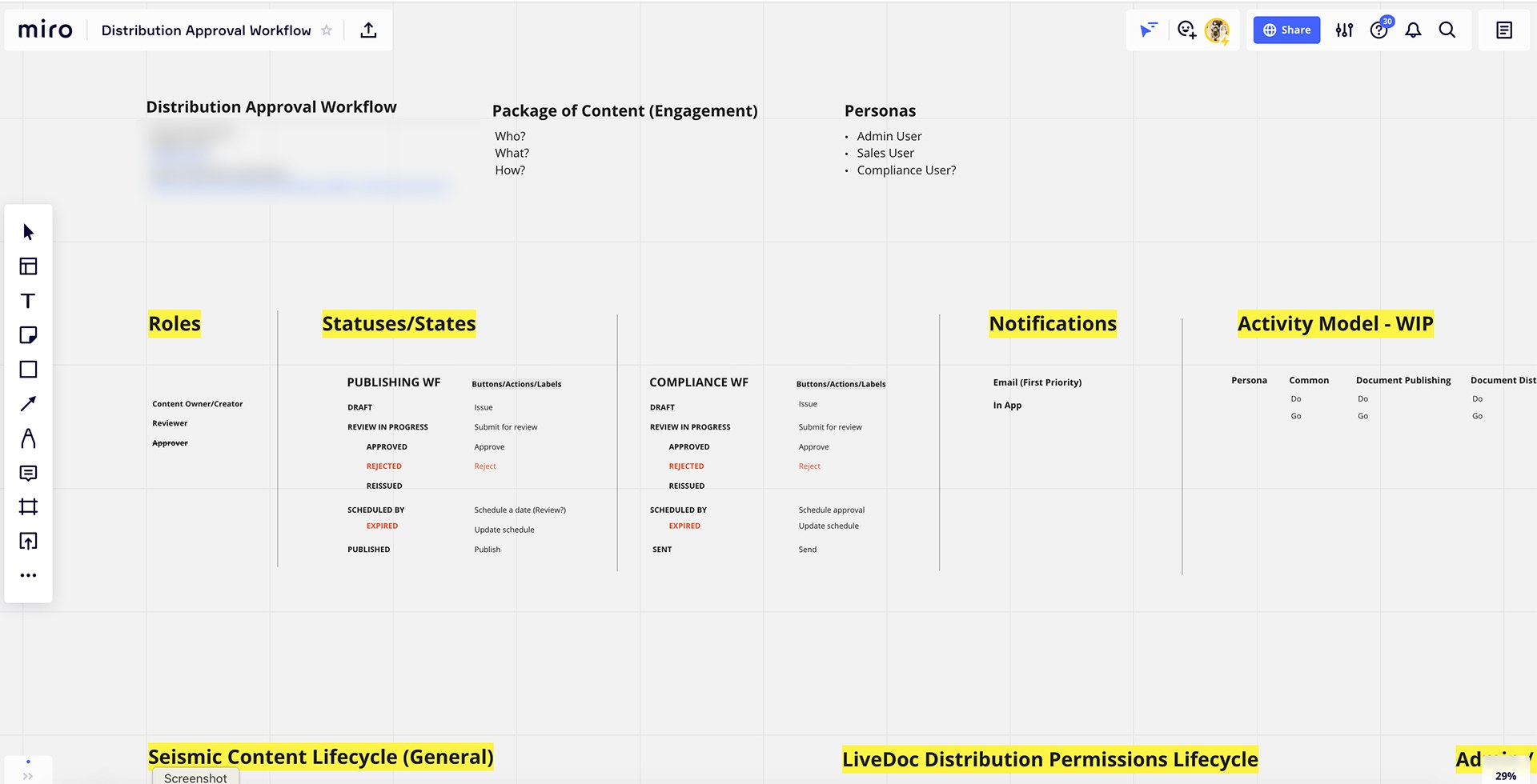
Board titled Distribution Approval Workflow with personas (admin user, sales user, compliance user), roles (content owner or creator, reviewer, approver crossed out) and two status tables side by side. Publishing workflow: draft, review in progress, approved, rejected, reissued, scheduled by, expired, published, each with its button label. Compliance workflow: the same states ending in sent instead of published. Notifications: email first priority, then in-app
Two workflows, one vocabulary. The status tables line up row by row, so a label means the same thing wherever an admin or reviewer sees it. Approver is crossed out: we merged it into Reviewer.

Decision 2: Approve the engagement, not the document

The existing approval unit was a document. But compliance needed to approve the whole package a buyer would receive: who it goes to, what it says, what's attached and how it's sent. We made the engagement the thing that gets approved, and plugged the new workflow into the content lifecycle at the point where a seller generates a LiveDoc and chooses to send it.

We also only gated when we had to. If an admin turned distribution approval off for a team site, content published there could be shared without it. Needs approval? No goes straight to Send now.
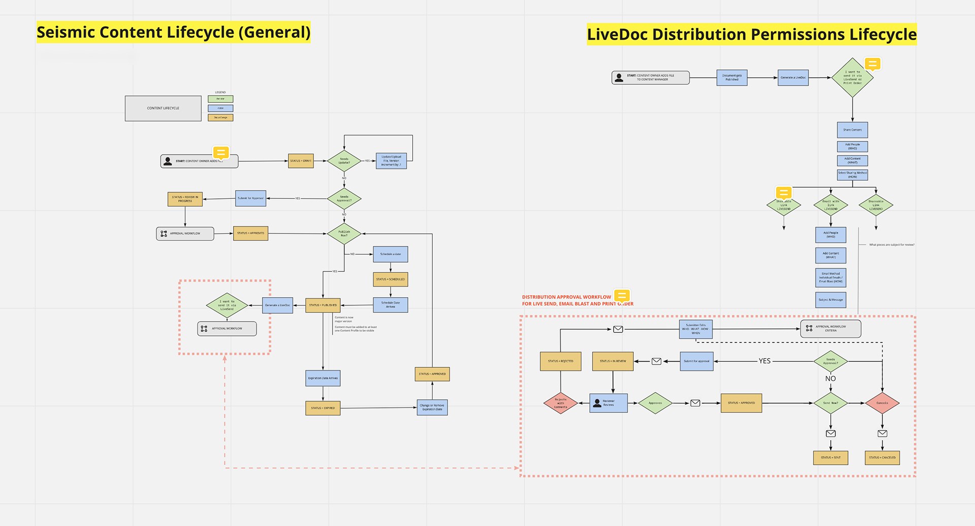
Two flow diagrams. Left, the Seismic content lifecycle: a content owner adds a file, it may need updates and approval, is published or scheduled, can expire, and a dotted box marks the new branch I want to send it via LiveSend, approval workflow. Right, the LiveDoc distribution permissions lifecycle: a document is published, a LiveDoc is generated, the seller shares it by shareable link, email with link or print order. A dotted red box labeled distribution approval workflow for LiveSend, Email Blast and Print Order shows the loop: needs approval, submit for approval, in review, reviewer reviews, approved or rejected with comments, then send now or schedule, ending in sent or canceled, with email notifications at each step
Where the new workflow plugs in. The dotted line connects the moment a seller decides to send (left) to the distribution approval loop (right). Envelopes mark every notification.

Decision 3: A separate approval dashboard for compliance

The obvious home for approvals was Engagement Center, where sellers already tracked what they'd sent. Part of the team wanted to put approvals there as another filter, since it was already built. I argued for a separate dashboard. Engagement Center is about activity: who opened what. Approval is management: what's waiting and who has to act. Mixing them would bury a compliance queue in engagement data.

We agreed on both. Compliance got an approval dashboard under Planner, and sellers kept Engagement Center with each engagement's approval status and current step on its card. Every path, from the dashboard, an email notification or a Seismic page, lands on the same engagement detail page. Reviewers arriving from the dashboard also get Previous and Next, so they can move through the queue without going back.
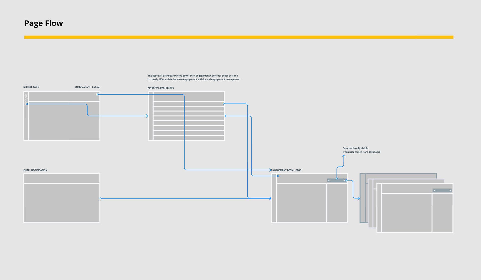
Page flow wireframe. A Seismic page and an email notification both link to the engagement detail page. The Seismic page also links to an approval dashboard, which opens the engagement detail page. A note reads the approval dashboard works better than Engagement Center for the seller persona to clearly differentiate between engagement activity and engagement management. A second note reads carousel is only visible when the user comes from the dashboard, next to a stack of detail pages
The page flow, with the reasoning written on it. Three ways in, one detail page. The carousel (Previous, Next) only appears when a reviewer comes from the dashboard.

For navigation I compared top-level tabs against a secondary side nav under Planner. Tabs were quicker to build but put publishing and distribution approvals at the same level as everything else. The side nav gave Approvals a home that could hold more queues later, so we went with it.
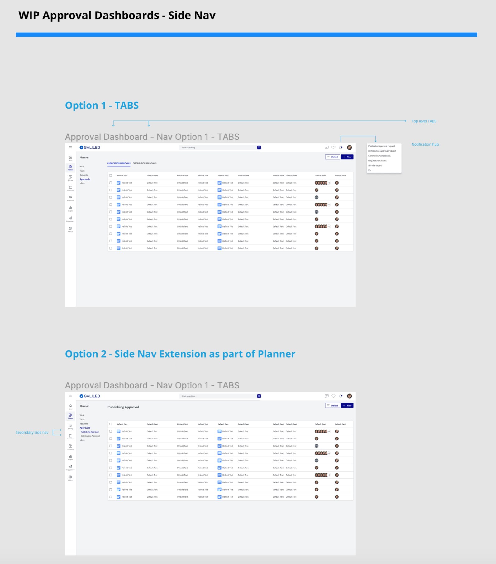
Board titled WIP Approval Dashboards Side Nav. Option 1, tabs: an approval dashboard with top-level tabs for publication approvals and distribution approvals, and a notification hub listing publication and distribution approval requests. Option 2, side nav extension as part of Planner: the same list with a secondary side nav under Approvals for publishing approval and distribution approval
Tabs (top) against a side nav inside Planner (bottom). We chose the side nav because it has room for more approval queues later.

Decision 4: Claim softly

We modeled three ways a group reviewer could take ownership. Implicit claim: whoever acts first owns the step. Soft claim: a reviewer claims the step and the rest of the group is notified, but can still act. Second reviewer claim: someone else in the group takes over a claimed step. A hard lock was the risky option: if one reviewer went on leave, the step would sit claimed and nothing would move. We went with the soft claim, and admins can choose the claim level in settings.
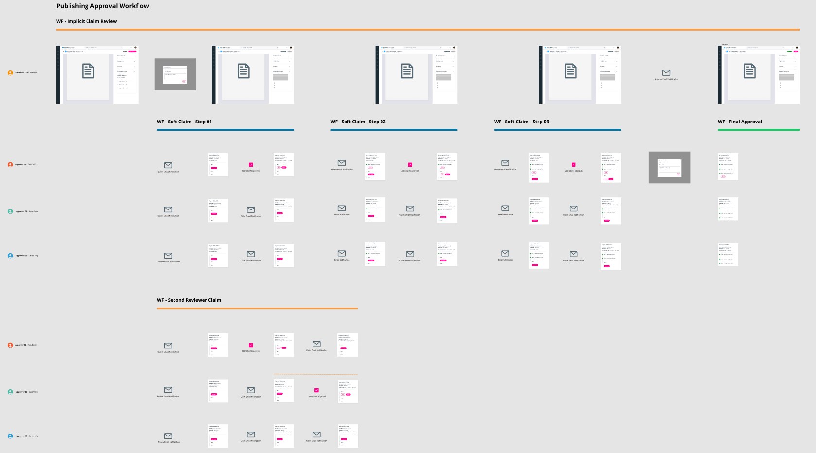
Publishing approval workflow storyboard. Top row, implicit claim review: a submitter's document moves through three steps to final approval. Below, soft claim steps 01, 02 and 03 for three approvers, each showing a review email notification, the approval panel, a user claims approval checkbox and claim email notifications to the others. At the bottom, second reviewer claim, where another approver claims a step already claimed
The claim models, per approver and per step. Each row is one reviewer in a group. Envelopes are the notifications the others receive when someone claims.

Design process and solution

Mapping every state

Before anything was high fidelity, I laid out every screen the seller and the reviewer would see in every state, connected by what triggers the move: in review, rejected and approved, including emails.
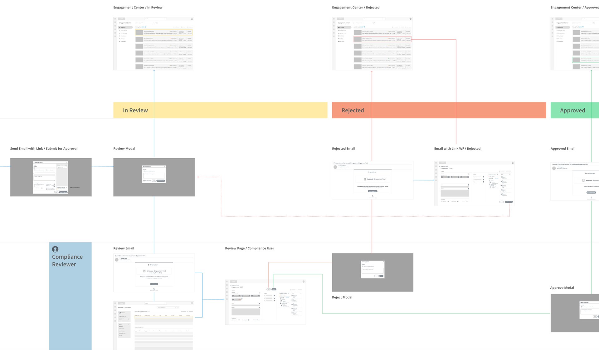
End-to-end wireframe flow in three colored bands: In Review, Rejected and Approved. Top row, Engagement Center in each state. Middle row, the seller submits an email with link for approval, the review modal, a rejected email, the rejected engagement and an approved email. Bottom row, the compliance reviewer's review email, reviewer's dashboard, review page, reject modal and approve modal, with lines showing how each screen leads to the next
One engagement through every state. The seller's screens run across the middle, the compliance reviewer's along the bottom, and Engagement Center in each state across the top.

Admin: setting the rules

Admins build a workflow in Approval Process Settings: the steps, the approvers for each step and who's the default, the notifications, and reminders if a step sits too long. I also ran UI QA on the existing admin styles, which gave us a short list of fixes to ship with it.
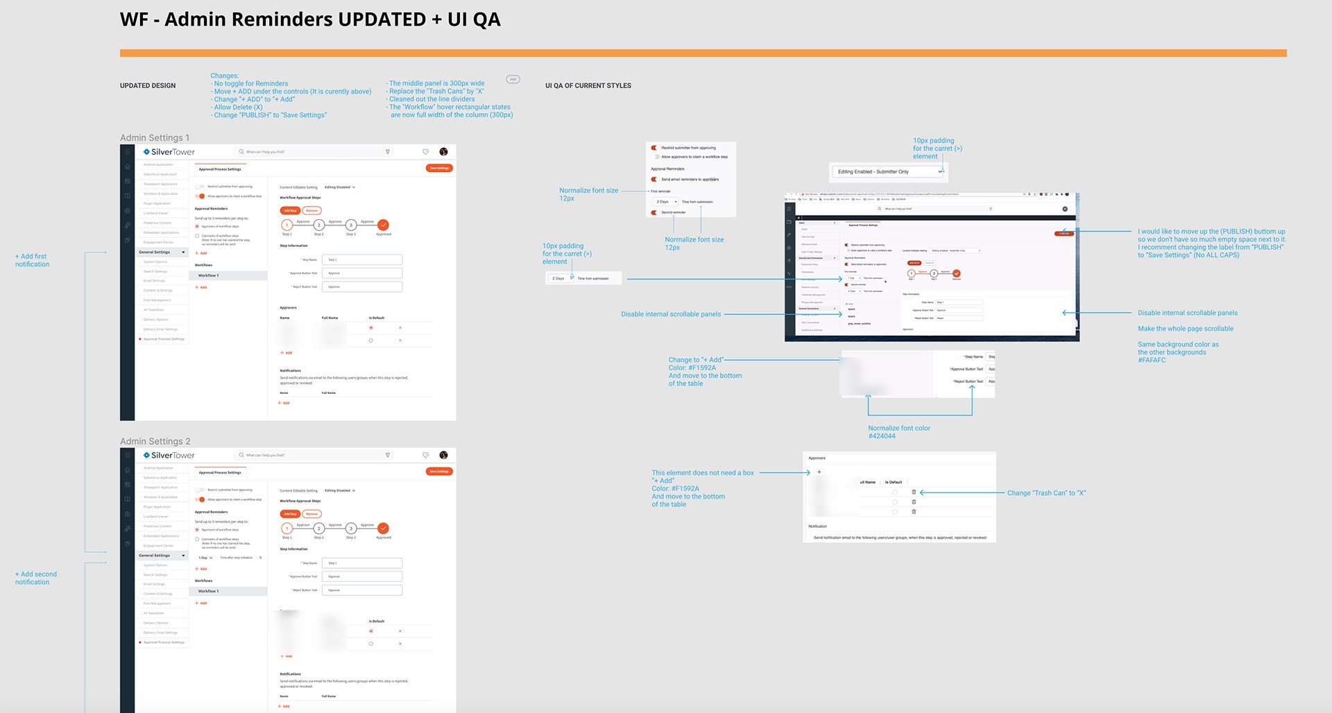
Board titled WF Admin Reminders Updated plus UI QA. Left, two versions of Approval Process Settings with a three-step workflow tracker, step information, approvers and notifications, annotated with changes: no toggle for reminders, move plus Add under the controls, allow delete, change Publish to Save Settings, a 300 pixel middle panel, trash cans replaced with X. Right, UI QA of the current styles with notes to normalize font size to 12 pixels, add 10 pixel padding, disable internal scrollable panels and make the whole page scroll
Admin settings, with the changes listed at the top. Publish became Save Settings, because admins were saving a rule, not publishing content. On the right, a UI QA pass on the existing screen: one font size, one scroll area, one way to add.

Seller: submit from where you share

Sellers don't go somewhere else to ask for approval. When content that needs approval goes into a LiveSend email, a banner says the workflow was triggered and by which file. Send becomes Submit for approval, and the seller picks the approver for the first step and can leave a message.
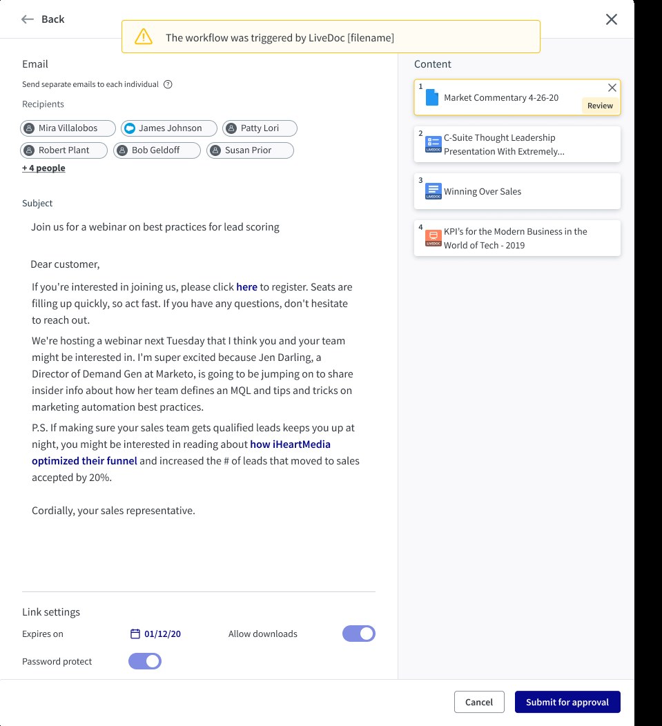
LiveSend email composer with a yellow banner reading The workflow was triggered by LiveDoc filename. Recipients, subject and a personalized message are on the left. On the right, the content list has the first item, Market Commentary 4-26-20, flagged Review. At the bottom, Cancel and Submit for approval buttons
Trigger: the banner names the file that needs approval, and that file carries a Review tag in the content list. Action: Send becomes Submit for approval. The seller never has to guess why they can't send.
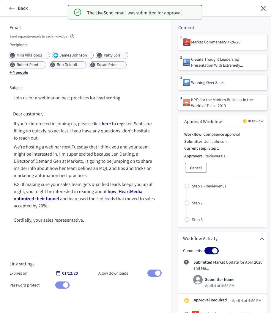
The same email after submission with a green banner, The LiveSend email was submitted for approval. The right rail now shows an Approval Workflow panel marked In review with the workflow name, submitter, current step and approvers, a Cancel button and a three-step tracker, and a Workflow Activity feed below with comments toggled on
Status panel: workflow, submitter, current step and approver in one card, with a step tracker. Activity: every submission, comment and decision in order. This panel appears everywhere the engagement does, for sellers and reviewers alike.

Reviewer: claim, then decide

Reviewer's view of the submitted email with Previous and Next controls reading 2 of 234. The flagged content item is highlighted. The Approval Workflow panel shows Claim this step with an info icon, and Reject and Approve buttons above the step tracker
The reviewer sees exactly what the buyer will receive. Claim this step tells the rest of the group they have it (Decision 4). 2 of 234 moves through the queue without going back to the dashboard (Decision 3).
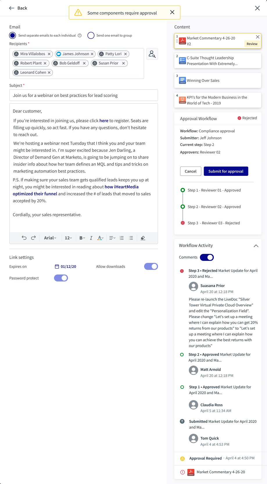
The seller's view of a rejected engagement. A banner reads Some components require approval. The flagged content now shows version 2. The approval panel reads Rejected with steps 1 and 2 approved and step 3 rejected, and a Submit for approval button. The activity feed shows the step 3 rejection with the reviewer's comment asking to relaunch the LiveDoc and change the wording, followed by the earlier approvals
Rejection as a loop (insight 3). The reviewer's comment says what to change, the step tracker shows where it failed, and the seller resubmits from the same screen once the content is fixed.

Dashboards

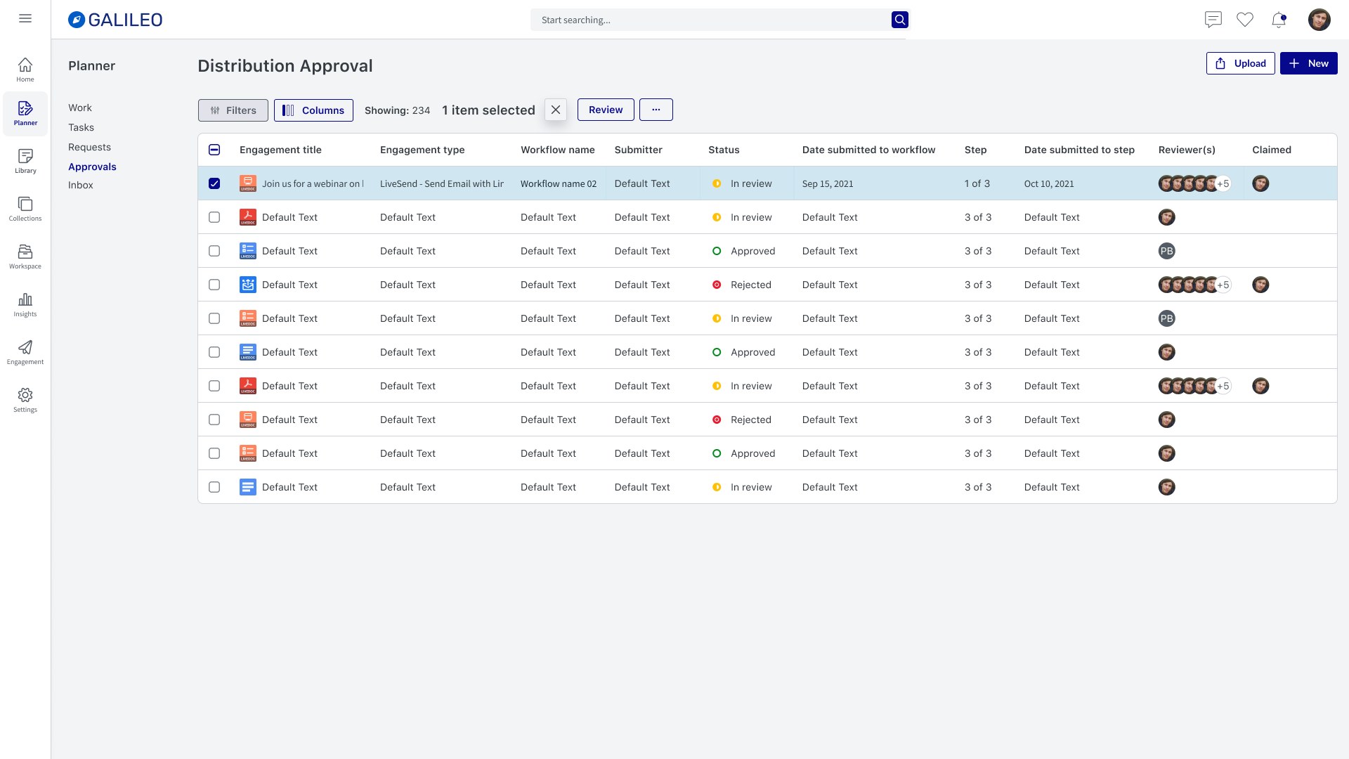
Distribution Approval dashboard under Planner, Approvals. A list with filters, columns and a Review button, one row selected. Columns: engagement title, engagement type, workflow name, submitter, status (in review, approved, rejected), date submitted to workflow, step (1 of 3), date submitted to step, reviewers and claimed
The compliance queue. Status and Step say where each engagement is, and Claimed says whether someone has it. Built on the shared Mantle datagrid, so filtering and columns work as they do elsewhere in Seismic.
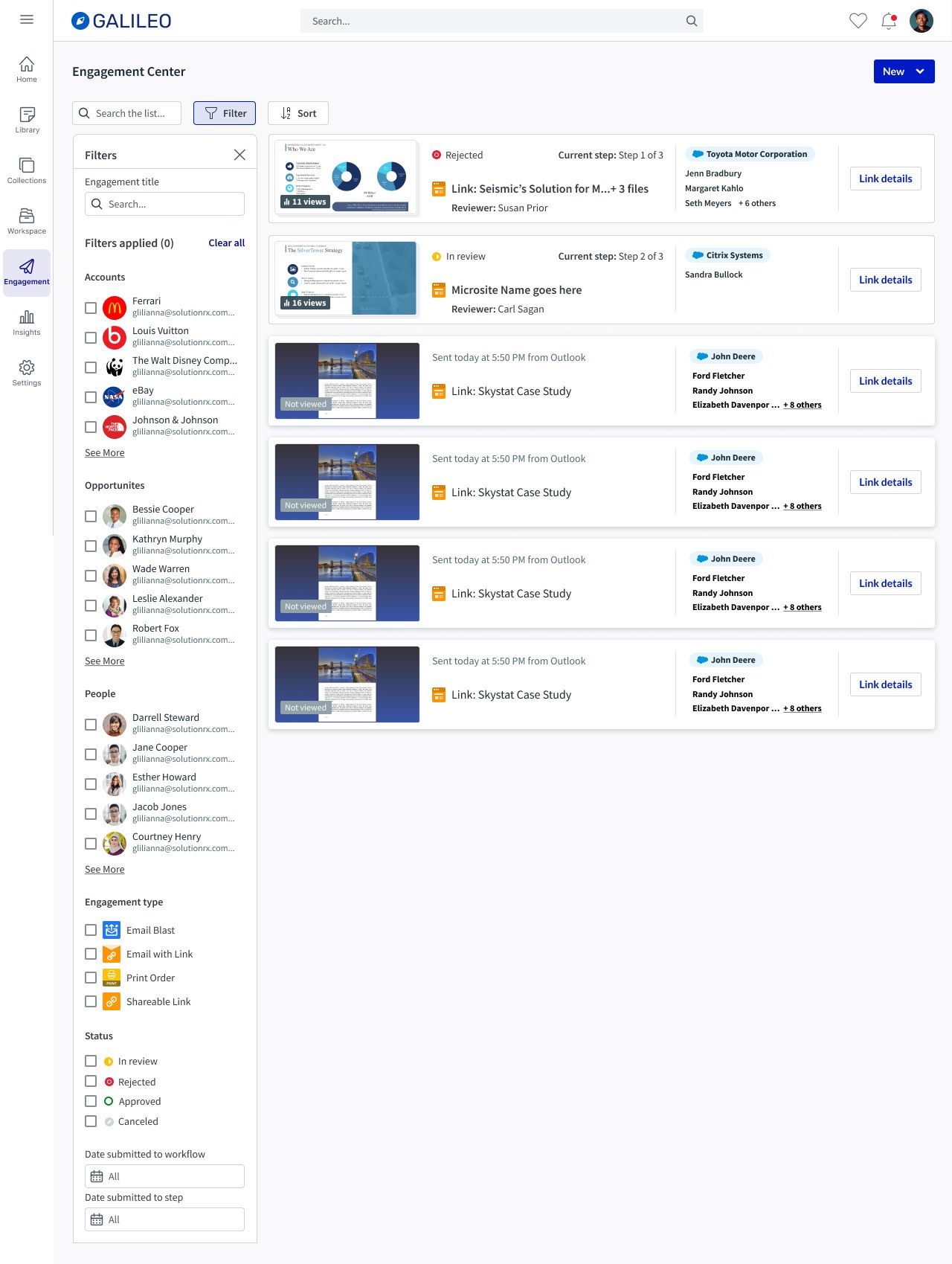
Engagement Center with filters on the left for accounts, opportunities, people, engagement type and status (in review, rejected, approved, canceled). Engagement cards on the right; the first reads Rejected, current step 1 of 3, reviewer named, and the second reads In review, current step 2 of 3
The seller's side. Engagement Center stays about activity, but each card now shows approval status, current step and reviewer, and Status is a filter.

Responsive

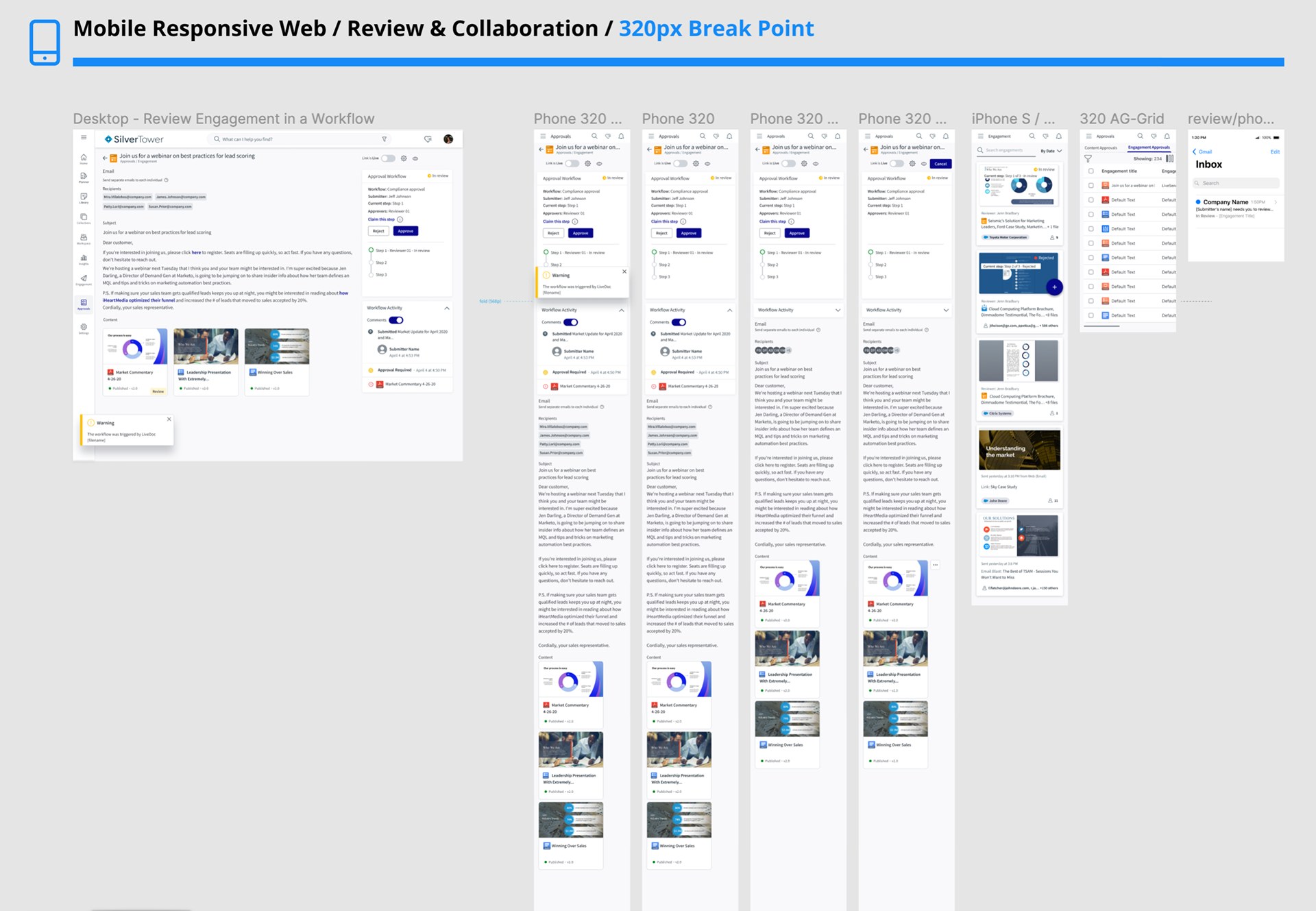
Board titled Mobile Responsive Web, Review and Collaboration, 320 pixel breakpoint. The desktop review page on the left, then a sequence of phone screens stacking the email, the approval panel, the activity feed and the content list, followed by the approvals list and Engagement Center at phone width
Review at 320px. The right rail stacks under the email in order of what a reviewer needs: status and actions first, then activity, then content.

Validation and iteration

I built click-through prototypes of the seller's flows (submit, then reject and resubmit) and tested them on UserTesting with 10 unmoderated participants: directors, managers and VPs in sales and business development, across four countries. The test goals were the clarity of states and flows, the activity widget, the review modals and the notification emails.
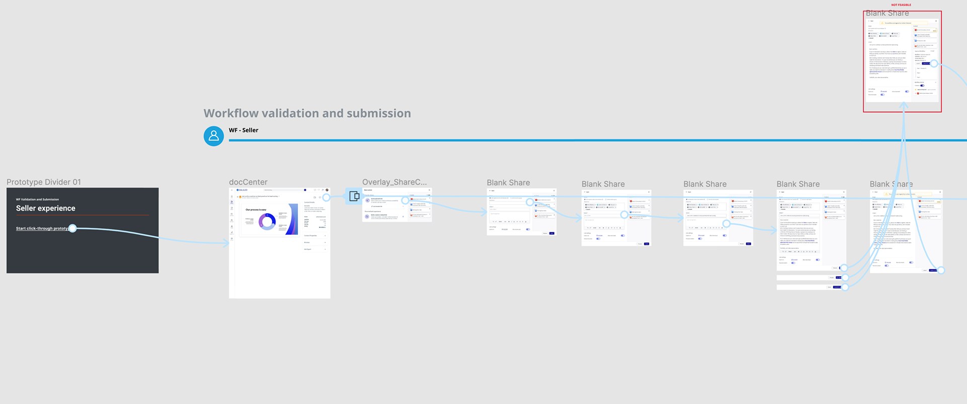
Figma prototype flow titled Workflow validation and submission, WF Seller. A divider slide reading Seller experience, start click-through prototype, leads to docCenter, a share overlay and a sequence of share screens. One share variant at the top right is boxed in red and labeled Not feasible
The seller prototype. One variant (boxed in red) was marked not feasible after an engineering review and taken out before testing.
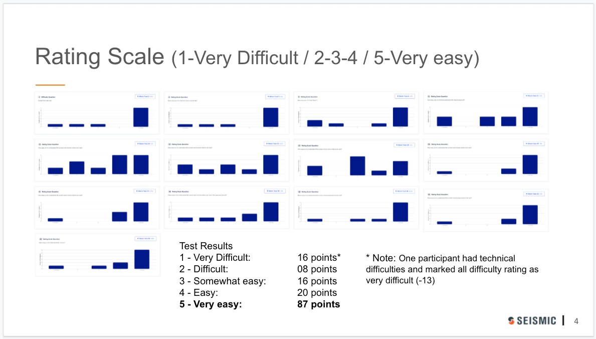
Slide titled Rating Scale, 1 very difficult to 5 very easy, with thirteen small bar charts, one per question, most peaking at 5. Test results: very difficult 16 points, difficult 8, somewhat easy 16, easy 20, very easy 87. A note says one participant had technical difficulties and marked all difficulty ratings as very difficult, accounting for 13
107 of 147 ratings were easy or very easy. 13 of the 16 very difficult ratings came from one participant whose prototype didn't load.

We thought a rejected engagement should stay rejected. People read that as stuck.

We thought the status should record the last decision, so an engagement stayed Rejected until a reviewer approved it. We learned that participants who resubmitted then saw Rejected again and assumed the resubmission hadn't worked. So we did two things: the status now changes from Rejected back to In review as soon as the engagement is resubmitted, and the activity feed records a Changed entry naming the updated document, so a reviewer can see what's different before deciding.
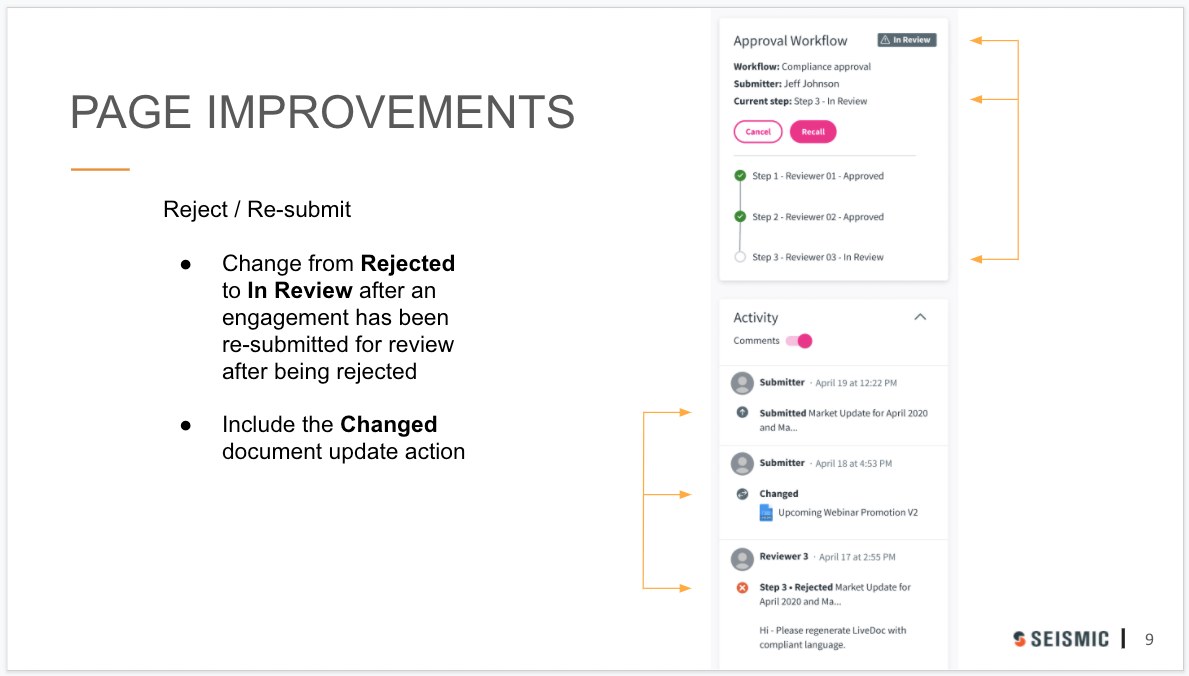
Slide titled Page Improvements, Reject and Re-submit: change from Rejected to In Review after an engagement has been re-submitted for review after being rejected; include the Changed document update action. On the right, the approval panel shows In Review with steps 1 and 2 approved and step 3 in review, and the activity feed shows a Changed entry for Upcoming Webinar Promotion V2 above the earlier rejection
The change, from the test readout. In review again after resubmitting, and a Changed entry pointing at version 2.

Outcome and impact

Approval workflows shipped in milestones between October 2021 and January 2022: LiveSend workflow triggers and cancel first, then email blast with approver selection, the compliance dashboard list view and the resubmit and revalidation flow. I ran visual QA against the dev environment for each one, in a shared log with engineering.
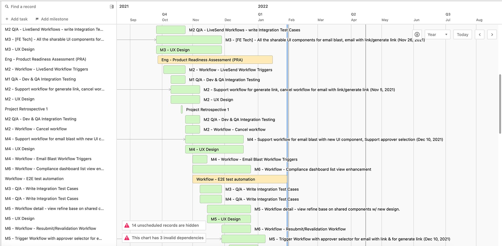
Gantt chart from September 2021 to August 2022. Milestones M2 to M6 between October 2021 and January 2022: LiveSend workflow triggers, cancel workflow, support workflow for generate link, email blast workflow triggers, support approver selection, compliance dashboard list view enhancement, resubmit and revalidation workflow, each paired with UX design, QA integration test cases and an engineering product readiness assessment
The delivery plan. Each milestone has its own UX design, QA test cases and engineering tasks, with a product readiness assessment running alongside.

Where approvals paid off

Financial services accounts
$1.2M Current ARR at HSBC Global Asset Management, whose use case is compliance and reporting Expanding to a Central Approvals Team
$137K Net new ARR from that expansion: 67 marketing and 7 field licenses Financial promotions approval
Won Pacific Life, taken from BigTinCan, with email blast and delivery approval on the list of what it took Insurance · 3,500 employees

Sources: internal account and win announcements. Approval workflows were one part of each deal, not the whole reason for it.

For the business, approval workflows met contract commitments to existing customers and gave Seismic an edge in winning regulated firms and upselling to the ones it had. HSBC Asset Management is a good example: it expanded Seismic to its Central Approvals Team to run financial promotions approval the same way worldwide.

For the product, the approval panel and activity feed became shared components. Publishing and distribution now show status the same way, so a reviewer who knows one knows the other.

What I'd do differently

  • Test the reviewer as hard as the seller. Our UserTesting study was built around the seller's flows because they were easiest to recruit for. Compliance reviewers are a narrow audience, but they spend all day in the dashboard. A few moderated sessions with real reviewers would have tested the queue, the claiming and the Previous and Next controls under real volume.
  • Agree on success metrics that outlast the project. My notebook from the start has Post release: analytics, goals met? OKRs, success metrics on it. We had strong test results and business evidence, but not time-to-approval or rejection-rate tracking from launch. Those two numbers would have shown whether the workflow sped compliance up or just made it visible.
  • Settle the design system first. Moving to Mantle mid-project meant rebuilding high-fidelity screens. Next time I'd push to lock the component foundation before high-fidelity work starts, or design directly in the new system from the first high-fidelity pass.

The broader lesson: in a compliance product, the approval itself is the easy part. The hard part is making sure nobody has to ask where something is. Every decision here, from one state vocabulary to soft claims and the shared status panel, came down to that.

Get in touch

Tell me a little about your project, what you’re working on, your timeline, or whatever you know so far. I read every message and will get back to you within a couple of days.

Please enter your name.

Please enter a valid email address.

Please add a short message.

Message sent

Thank you for your note! I will get to you shortly.