Seismic · 2022
Seismic for Meetings
Seismic tracked every email, link and sales room a seller sent, but knew nothing about the meetings where deals actually move. I led the design of the meeting record: one page that lines up what was said, what was shown and what happens next. Our first pilot customer signed a $600K contract once it was done.
Client
Seismic
Year
2022
Role
Lead Product Designer
Team
Product management, Engagement and Ecosystem engineering teams
Product area
Seismic Engagement · Meetings
Focus
Product UX · Rich Media · Research
In one line
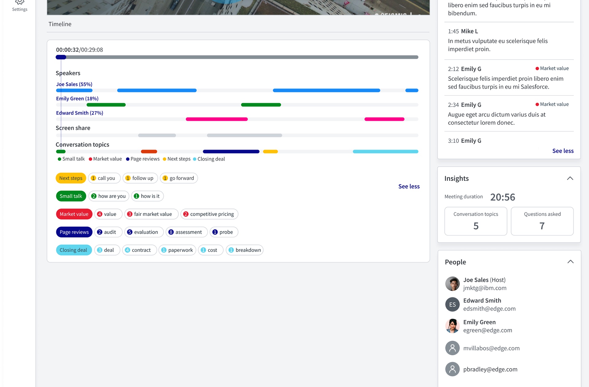
Sellers spend most of their week on meetings, and Seismic's engagement data stopped at the meeting's door. I designed Seismic for Meetings, starting with the post-meeting record: a timeline, transcript and content view that shows managers, enablers and marketers what happened in a call without rewatching it.
Context and the problem
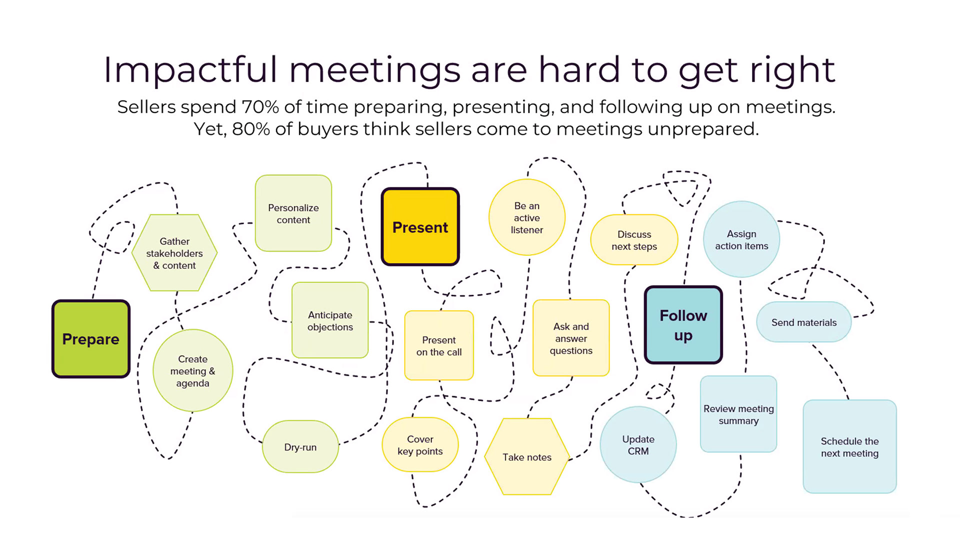
Seismic is a sales enablement platform. By 2022 it could tell a seller exactly who opened a LiveSend link, which pages of a deck a buyer read and how long they stayed in a digital sales room. The meeting itself, where most deals move forward, was a blank.
The ask came from two directions. Managers wanted insight into remote meetings so they could track deal progress and give feedback. Enablers wanted the full picture of the conversations happening across their organization. Meanwhile, conversation intelligence tools like Gong and Chorus were recording calls and building the category without us.
The constraints:
- Three kinds of meeting, three kinds of data. A meeting could be presented in person from Seismic, held online with document tracking, or held online with metadata only. One page had to make sense for all three.
- An existing product. Meetings Core already had people, content and activity widgets and a draft state. New work had to fit alongside it, not replace it.
- Two engineering teams. Shared widgets and post-meeting analytics were built by different teams on different timelines.
- Pilot first. The first release had to ship to a pilot customer before the full intelligence layer existed, so every feature had to work on day one with less data.
My role and what I owned
I was the lead product designer for Meetings, working with a product manager and two engineering teams.
- I owned the discovery interviews and synthesis, the personas framing, the information architecture of the meeting record, the interaction design of the timeline, transcript and screens, the prototypes and usability test plan, and the dev-ready specs for every widget across every meeting state.
- Product management owned the roadmap, pricing and pilot relationships, and co-ran the customer sessions with me.
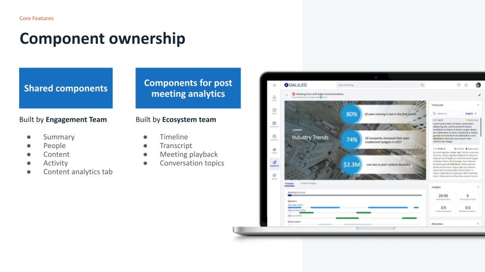
- The Engagement team built the shared widgets (summary, people, content, activity). The Ecosystem team built post-meeting analytics (timeline, transcript, playback, conversation topics).
The figures are slides from the discovery deck, screens and spec files. People, companies and figures in the mockups are placeholder data. I've cropped the interview slide to the quotes, left out screenshots of internal messages that name individuals, and removed two links to internal files.
Goals, and how we'd know
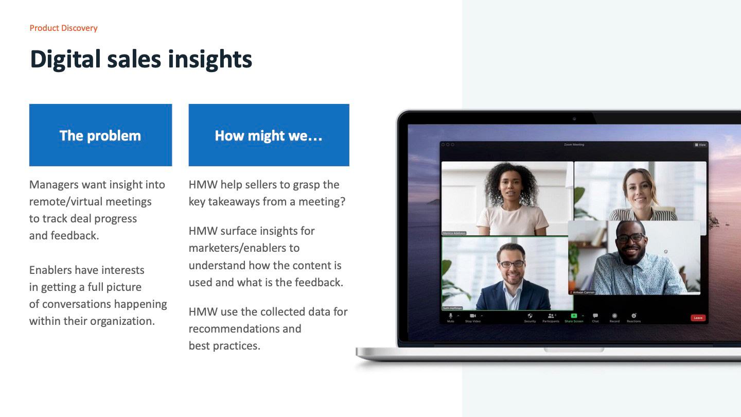
Each how-might-we became a measure we could check:
- Takeaways without a rewatch. A seller or manager can find the key moments of a 30-minute call, such as next steps, pricing or a question the buyer asked, in under a minute. Tested with task completion in usability sessions.
- Content that reports back. An enabler or marketer can see which content was shown, for how long, and what was said while it was on screen.
- Data that compounds. Every captured meeting adds to the data behind coaching and content recommendations, so the page is also the start of an intelligence layer.
- Deals it unblocks. For the business, success meant closing customers who had made meeting insight a condition of signing.
What we learned in discovery
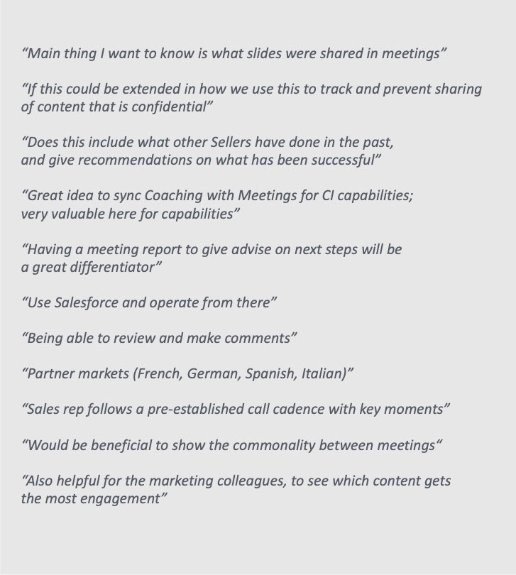
Between early February and the end of March 2022 we ran twelve sessions: product discovery and feedback calls with customers including Intel, Ameriprise and Aerogen, plus internal sessions with customer success teams who heard what customers asked for every week.
1. The slide is the unit of insight
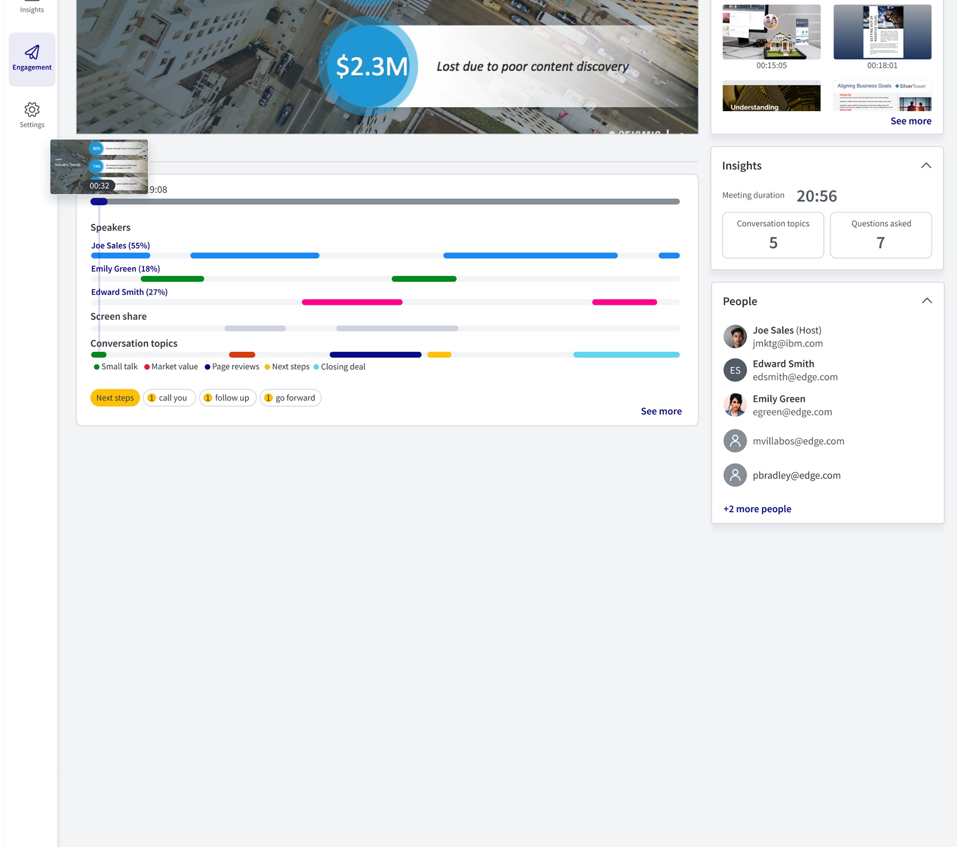
The first thing customers asked for wasn't a recording or a transcript. It was what slides were shared. Call recorders could tell you what was said. Nobody could tell you what was on screen when it was said, and that was exactly the data Seismic already had. So the timeline became the spine of the page, with speakers, screen share and topics on one time axis.
2. The main readers weren't in the meeting
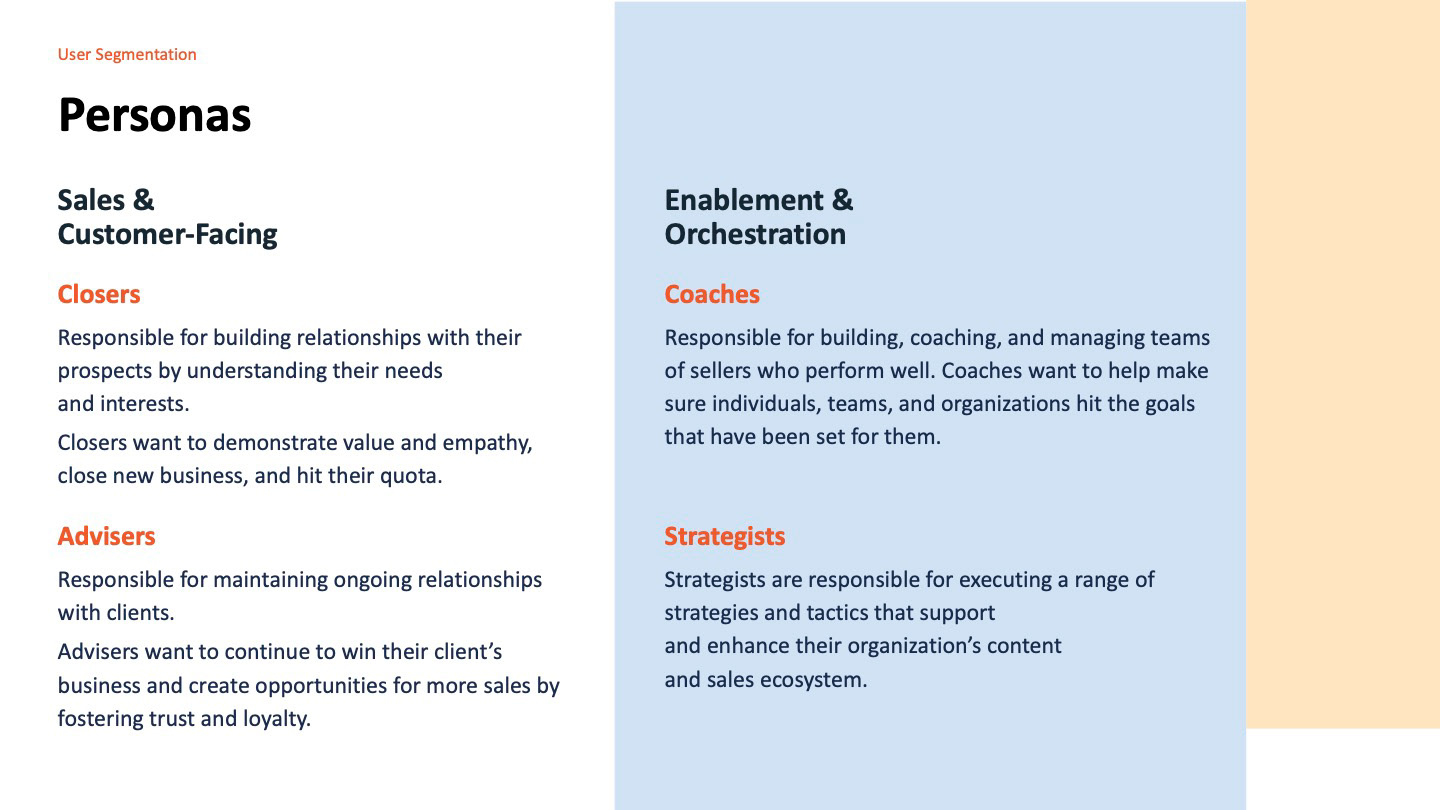
Sellers were in the room, but the people asking for this were managers, coaches, enablers and marketers who would review the meeting afterwards. We regrouped the audience into two segments, sales and customer-facing (closers and advisers) and enablement and orchestration (coaches and strategists). So the page was designed for review, not recall: summary numbers first, then detail on demand.
3. Good calls follow a shape
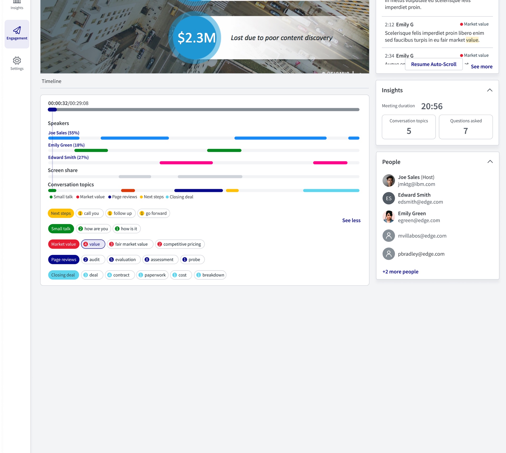
Customers described a pre-established call cadence with key moments: small talk, value, review of materials, next steps, closing. They also wanted to show the commonality between meetings. So conversation topics became a first-class lane on the timeline, with the keywords behind each topic and a count of how often they came up, so meetings could be compared by shape and not only by length.
Strategy and the decisions that mattered
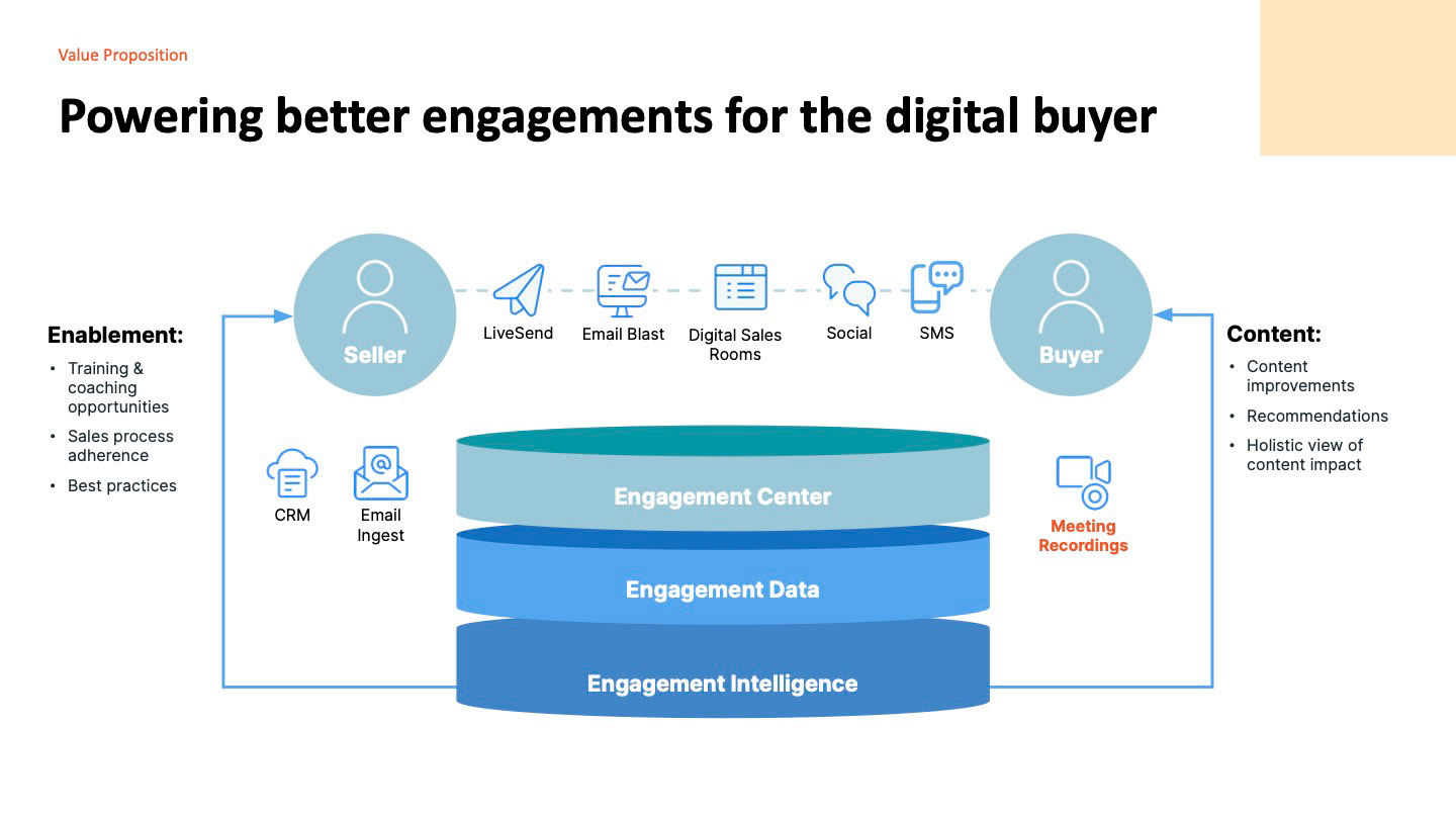
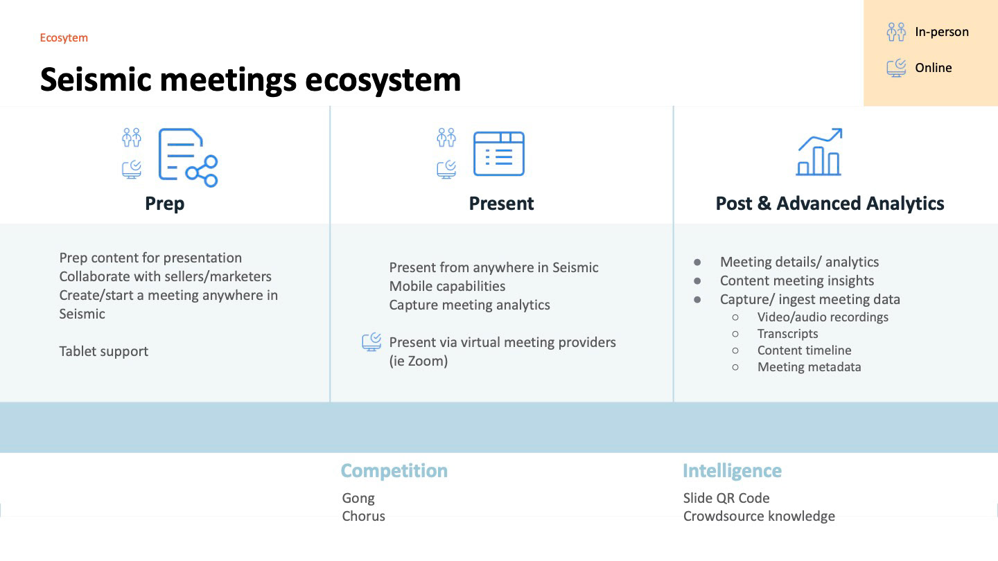
We mapped the whole meeting lifecycle before choosing where to start: prep, present, and post-meeting analytics, each across in-person and online meetings.
Decision 1: Compete on content, not on recording
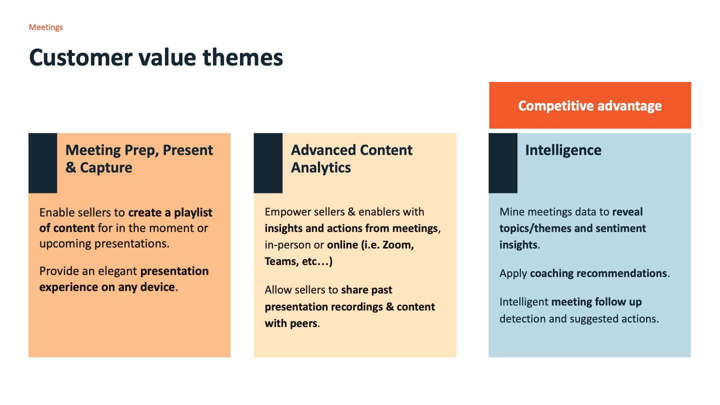
We could have built a call recorder with Seismic branding. We'd have been late, and behind two focused competitors. Instead we framed three customer value themes and put intelligence, meeting data joined to content data, as the competitive advantage. Recording and transcripts were table stakes. The differentiator was knowing that the buyer asked about pricing two minutes into slide 4.
Decision 2: One page that grows with the data
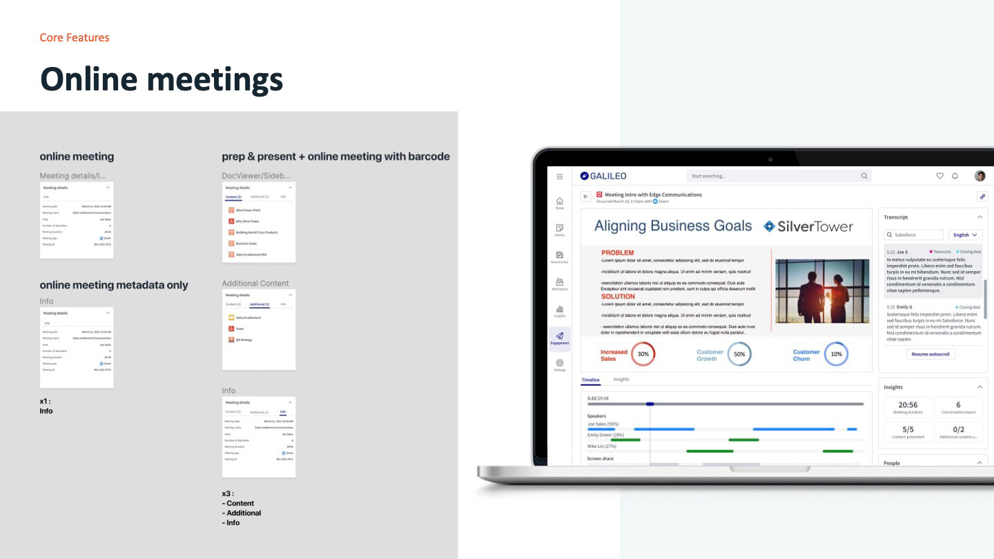
A metadata-only Zoom call and a fully tracked in-person presentation produce very different amounts of data. Designing three pages would have tripled the work and confused users moving between them. I designed one meeting record whose panels appear as data becomes available: a metadata-only meeting shows a single Info tab, a tracked meeting adds Content and Additional, and a recorded one adds the timeline and transcript. Empty states explain what's missing rather than hiding it.
That also set the release order. The pilot shipped online meetings without document tracking first, so the shell, people and activity widgets were proven with real customers before the analytics arrived.
Decision 3: Split the build along the page's seams
With two engineering teams, the risk was a page that looked like two products. We divided ownership by component: the Engagement team built the widgets every meeting has, and the Ecosystem team built the widgets only recorded meetings have. Both built against the same Mantle design system components and the same specs, so the join didn't show.
Decision 4: A meeting record should be read-only
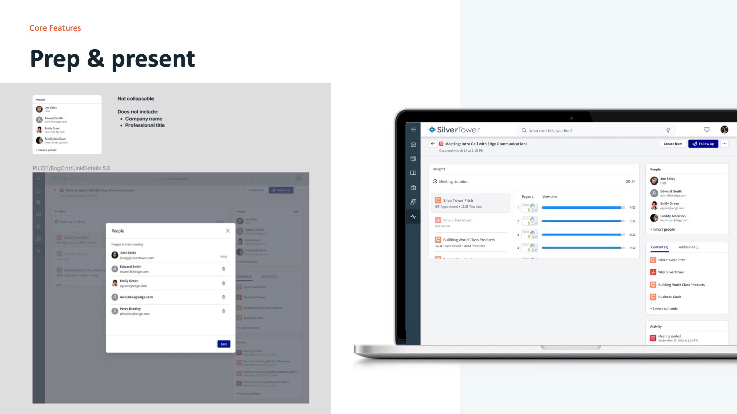
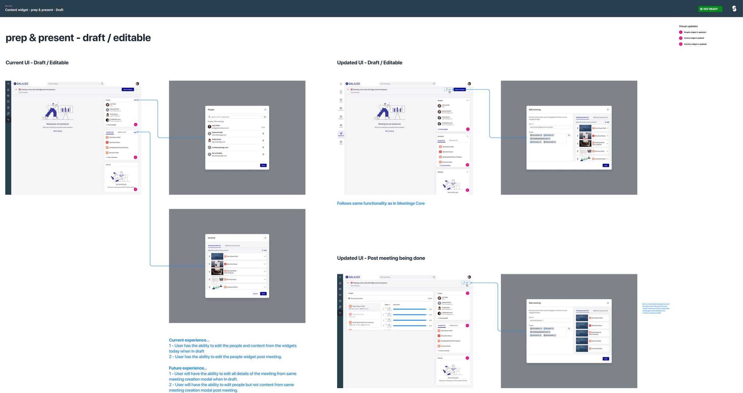
In the existing product, people and content could be edited straight from the widgets while a meeting was in draft, and people could still be edited after the meeting. Some of the team wanted to keep that, since it was already built. I argued against it. Once a meeting has happened, the attendee list is a record: coaching and analytics depend on it, and an inline trash icon makes it too easy to change by accident. We agreed on a compromise. All editing moved into the same meeting-creation modal used everywhere else, drafts stayed fully editable there, and after the meeting only people could be edited, never the content that was actually presented.
Design process and solution
Early concepts
The first concepts reused the existing engagement detail page and added meeting data to it. They helped us agree on the panel structure, and showed quickly how much the existing widgets would have to change.
The meeting record
The final page reads top to bottom from what happened to why it matters: the recording, the timeline under it, and a right rail with the transcript, insights and people.
Seismic's launch video shows the product in motion: Seismic for Meetings: Make the Most of Every Meeting
Specs, state by state
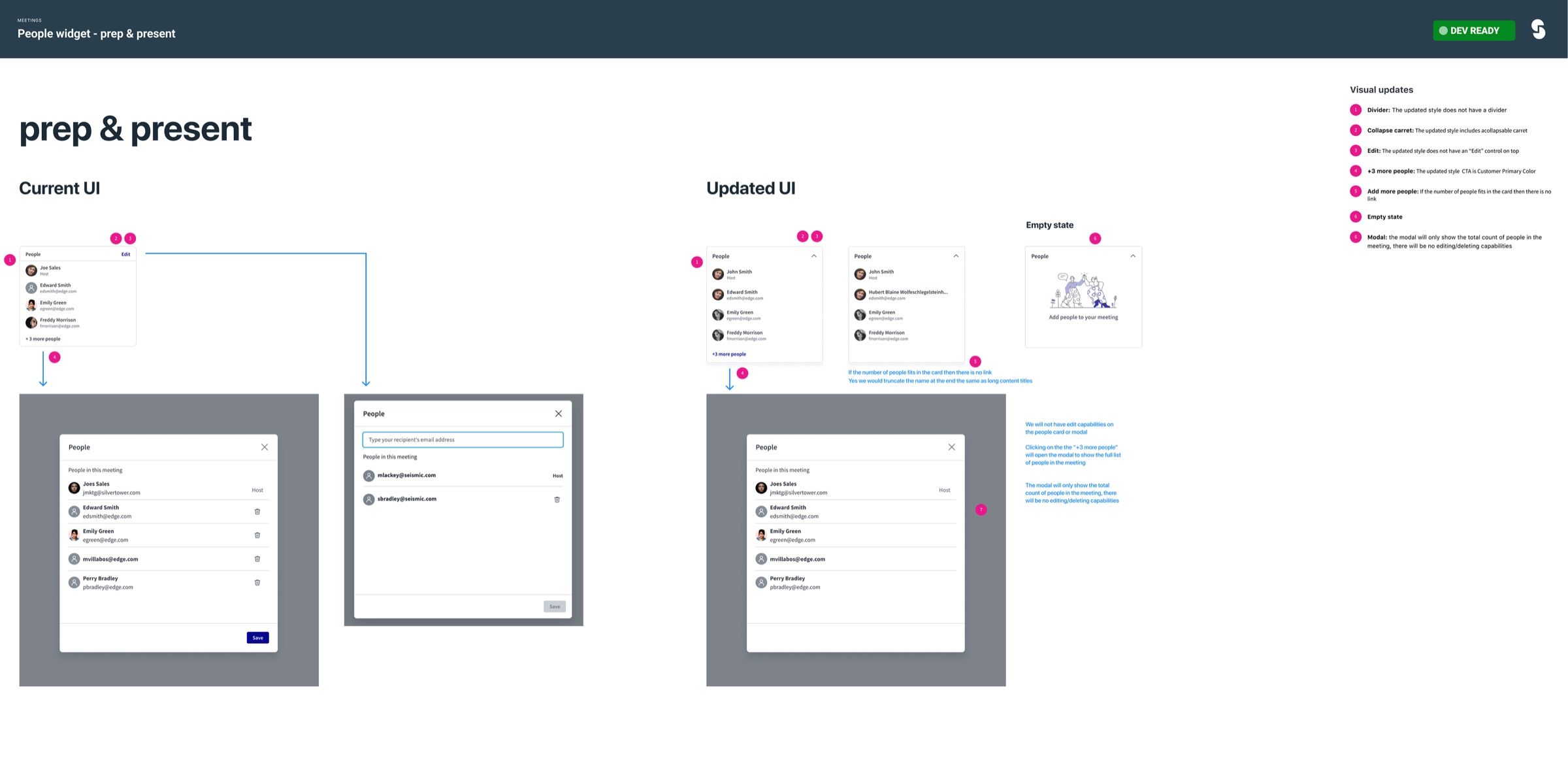
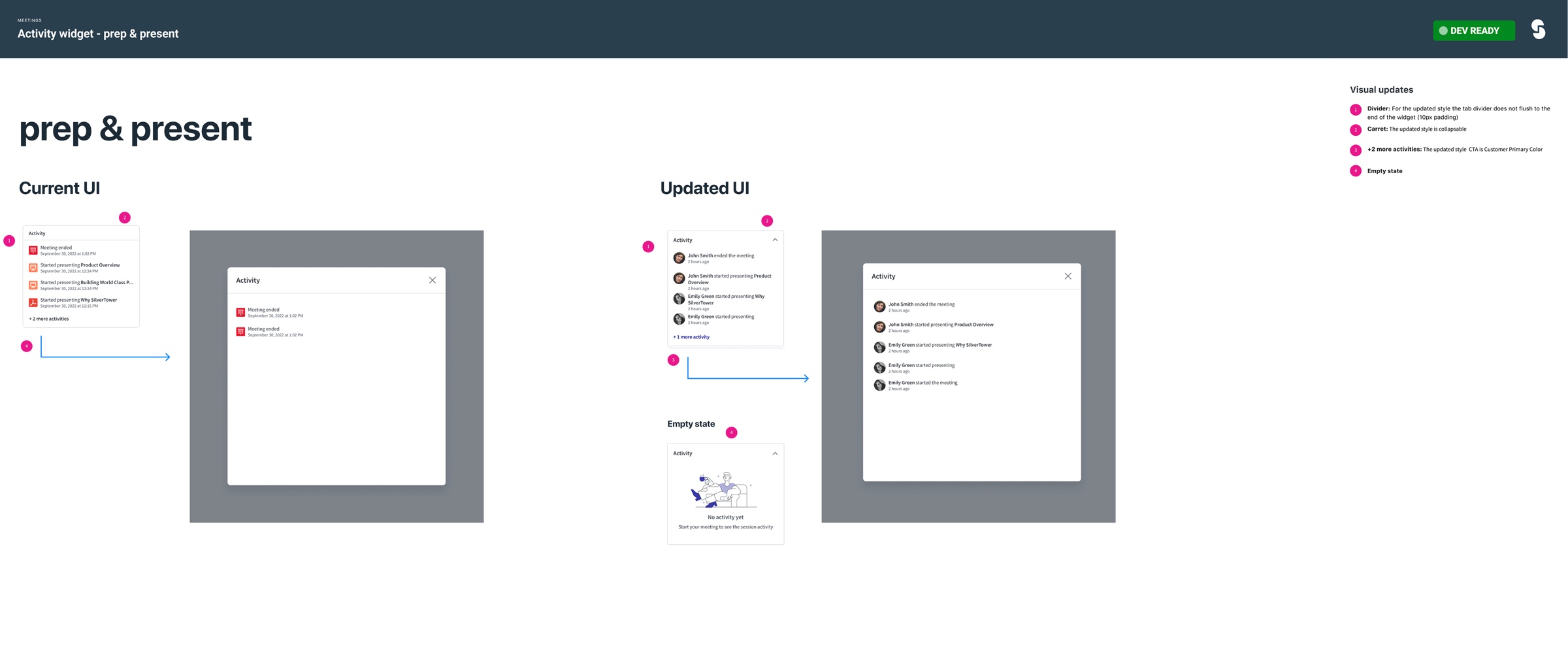
Because two teams were building against the existing Meetings Core, every widget was specified as current UI next to updated UI, with numbered changes and every state: draft, live, post-meeting and empty.
Validation and iteration
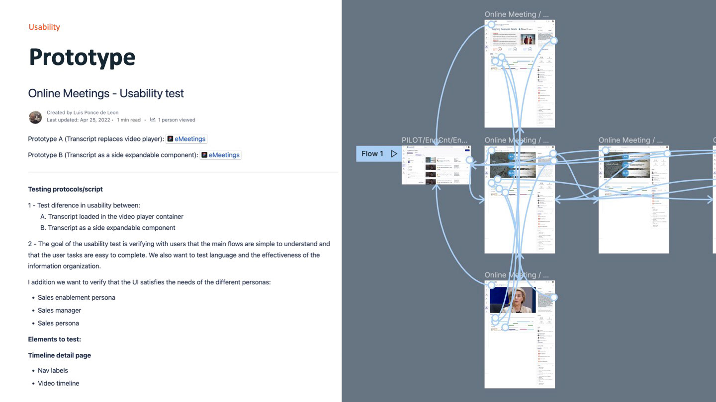
We thought the transcript should replace the video. It had to sit beside it.
We thought most people reviewing a meeting would either watch it or read it, so Prototype A swapped the video player for the transcript to keep the page simple. We learned that participants did both at once. They searched the transcript for a phrase, then wanted to see which slide was on screen when it was said. Swapping views broke exactly the connection that made Seismic different. So we did three things: shipped Prototype B with the transcript in a side panel next to the video, added a Screens tab beside the transcript so slides could be scanned without playing anything, and added slide previews to the timeline scrubber.
The same sessions tested the language. Labels were checked with each persona so a manager and a marketer read the same words the same way.
Outcome and impact
After launch
Seismic for MeetingsSources: internal launch and contract announcements, and Seismic's FY25 strategic priorities. The $8M figure is a target, not a result.
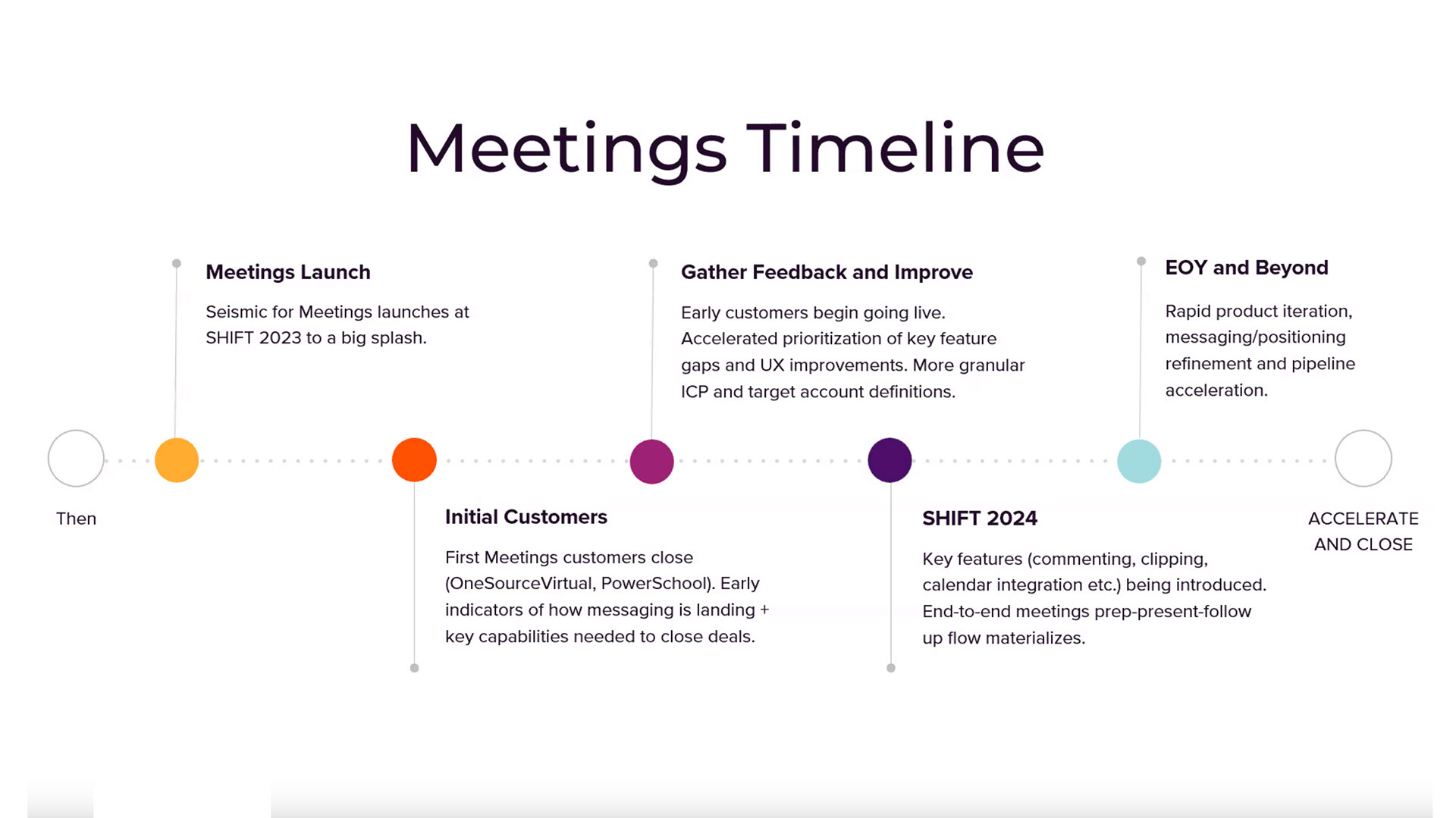
The first proof was commercial. JPMC wouldn't sign with Seismic until the Meetings work was completed and signed off. When they did, the contract was worth $600K, with more expected from other business units. Later, IBM, Seismic's largest account, brought 16,081 users live on Meetings.
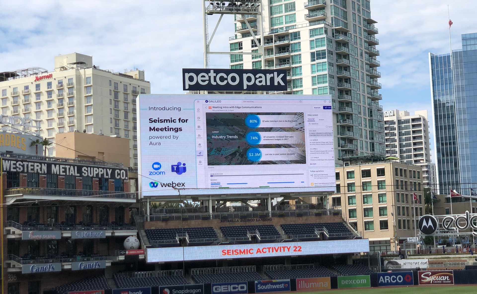
Meetings launched publicly at Seismic Shift, the company's annual conference, and by FY25 it was one of Seismic's eight company-level strategic priorities.
What I'd do differently
- Prototype with real transcripts. Our prototypes used placeholder text, which made every transcript look tidy and every topic look obvious. Real calls are messy, with crosstalk and half-finished sentences. Testing with a few real recordings earlier would have shown sooner where topic detection needed guardrails.
- Instrument the page from day one. We had strong business evidence and good qualitative feedback, but not task-level data. Tracking time to first insight, transcript search use and Screens tab use from the pilot would have told us which parts of the page were doing the work.
- Design the follow-up with the record. Customers asked for meeting reports that suggested next steps, and the complete prep, present and follow-up flow only came together at SHIFT 2024. I'd sketch the follow-up step alongside the meeting record, even if it shipped later, so the page was built with it in mind.
The broader lesson: when you're late to a category, don't build what the leaders built. Find the data only you have. For Seismic, that was the content on screen, and making it the spine of the page is what made the product worth buying.