Seismic · 2025–2026
AI-Powered Mobile
Seismic Mobile had been flat for years. We rebuilt it around an AI assistant, with a new navigation architecture, Aura chat, voice, and podcast generation. Monthly active users grew 25% year over year, from 10,395 to 13,025.
Client
Seismic
Timeline
2025 – 2026
Role
Lead Product Designer
Team
Mobile squad: engineering, product, design
Platform
iOS & Android · phone and tablet
Focus
AI · Navigation architecture · Product UX
Shipped
Fall release + FY26 roadmap
Outcome
+25% MAU YoY
The problem
Seismic Mobile had stalled. Monthly active usage had been flat for years, the information architecture predated the company's move into AI, and sellers who lived in the desktop product had little reason to open the phone app. Meanwhile the market had moved: buyers expected assistive, conversational tooling everywhere they worked.
The brief was not add AI to mobile. It was to rebuild the mobile surface so that AI had somewhere coherent to live, and so that everything after it could ship faster.
Who this is for
The user is a field seller: an account executive between meetings, in a car, in a lobby, on a client's guest wifi, with five minutes and one hand. The constraint that shaped everything: this person is never at a desk when they need the app. Poor connectivity is normal, attention is partial, and reading is often impossible.
My role and scope
I was the lead product designer on Mobile, embedded in one squad with engineering and product.
- I owned the use-case audit, the navigation architecture and its explorations, every Aura surface on mobile (chat, search, voice, podcast generation), the Social and compliance flows, authentication, rewards, and the component patterns and states that engineering built against.
- The team owned the platform rearchitecture, the Aura model and retrieval layer, and the release engineering behind the Fall pilot.
- Shared. Scoping and sequencing with product, and the pilot programme with customer success.
Goals and how we'd know
We set the bar before designing anything, because "modernize mobile" is not a measurable goal:
- Reverse the MAU trend. Flat-to-declining was the baseline; any credible redesign had to bend that line.
- Make AI a reason to open the app, not a feature behind a tab nobody visits.
- Validate demand before GA through a customer pilot, not internal opinion.
- Leave an architecture the roadmap can build on, so the next four features don't each need a navigation exception.
Starting with the gap, not the screen
Before touching navigation I audited every job a seller does in the field against what mobile could actually do, and tagged each one available or not available.
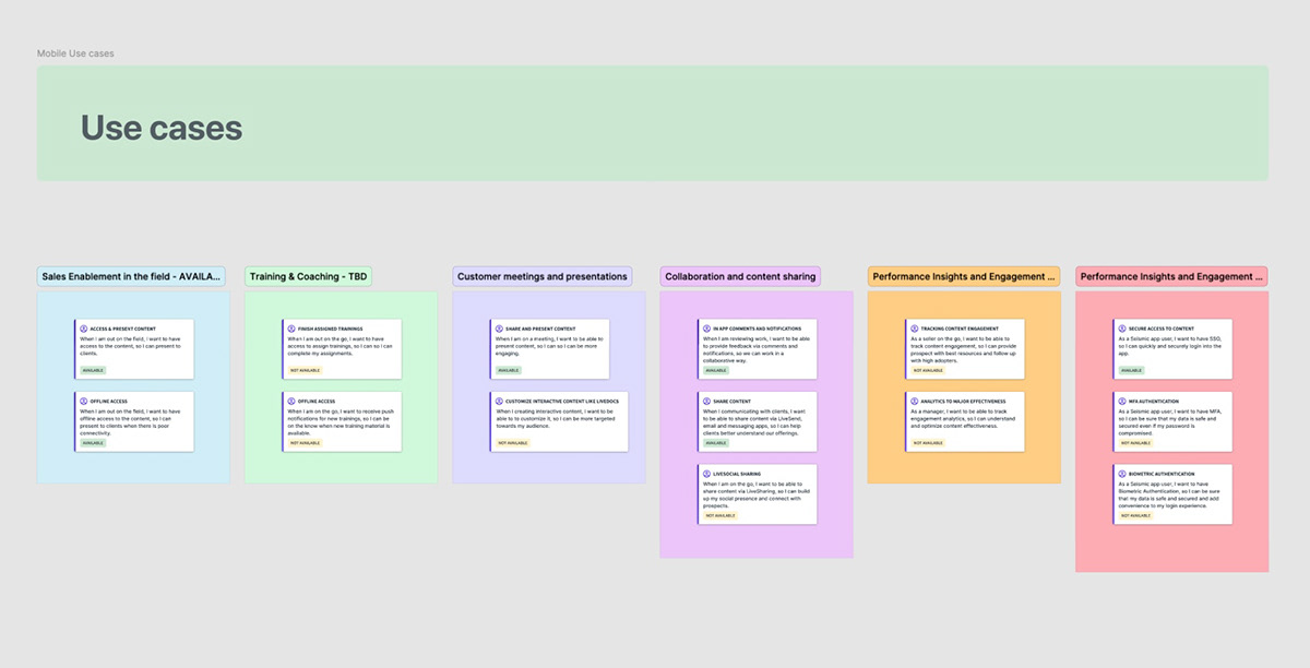
The pattern was the finding. The stories marked not available were not edge cases. They were the moments that make the app worth opening: offline training material, customizing content before a meeting, sharing to LiveSocial, engagement analytics, biometric sign-in. The ones marked available were mostly passive: view a document, present a deck.
Mobile could show you things. It could not help you do anything. That is why the usage line was flat.
The insight that set the direction
I wrote the seller's day as a sequence of moments rather than a feature list. The same scene kept recurring, and it was not a screen at all. It was a commute.
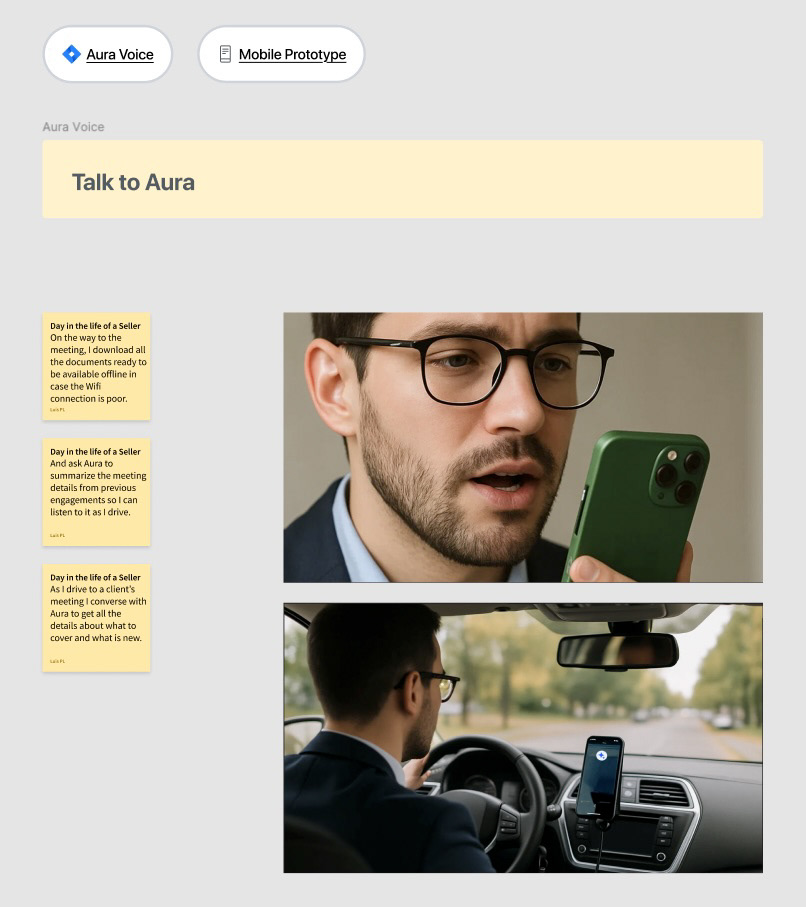
Three insights came out of it, and each one killed a design option:
- The highest-value minutes are hands-free. A seller preparing in the car cannot read. That made voice and audio output a requirement, and it is why podcast generation exists in this product at all.
- Connectivity is assumed hostile. Sellers pre-download because they expect the network to fail, so offline queues belonged in the architecture, not bolted on.
- The question is always about a specific engagement. Not "find me a document" but "what did we agree last time, and what do they still want?" Generic search couldn't answer that; the assistant needed account context.
The decision that mattered: where Aura lives
The tempting move was a floating assistant button over the existing app: cheap, fast, and what most products did that year. I argued against it: the audit had already shown the real problem was the app's structure, not its lack of a chat window. So I explored navigation from scratch.
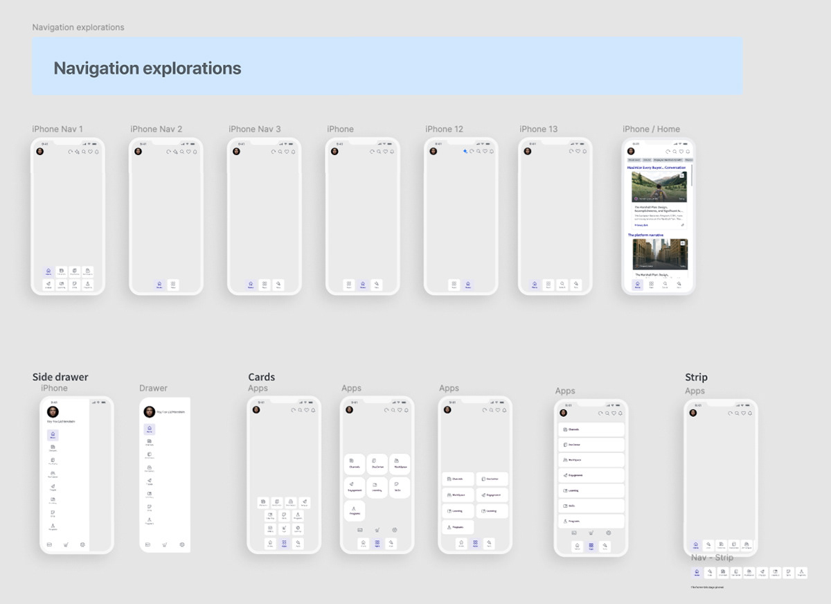
The tradeoff was real. A five-tab bar exposed more of the product but made every label unreadable. A side drawer kept the bar clean while hiding the whole catalogue behind a hamburger, the pattern that had made the old app forgettable. A three-tab bar was elegant and overloaded one screen.
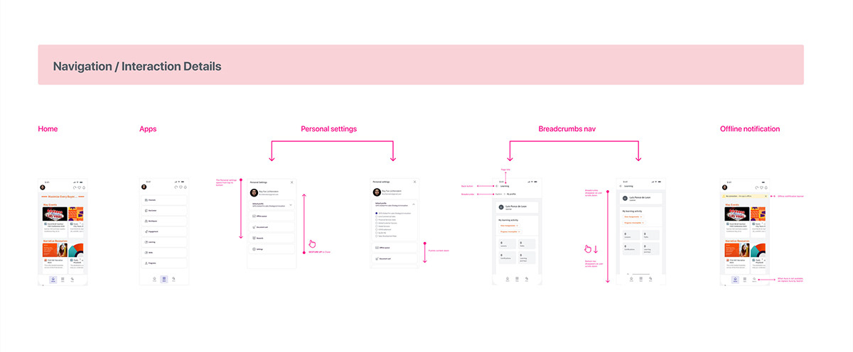
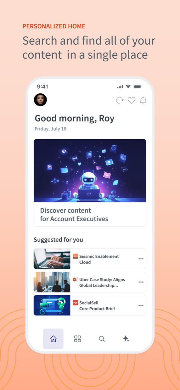
I landed on four tabs: Home, Apps, Search, Aura, with the catalogue promoted into an Apps overlay. Aura became a first-class destination with a permanent address, which is what later let it absorb chat, voice, search and history without another navigation rewrite.
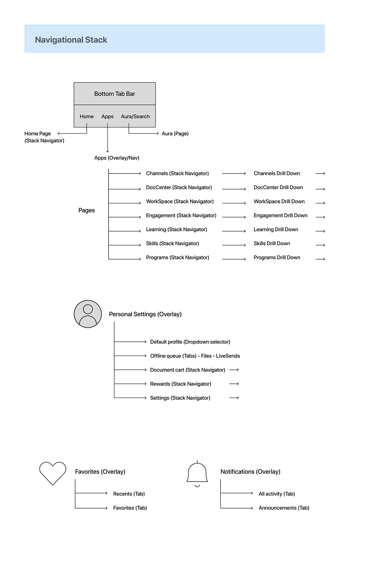
Writing the stack out this way was the point at which the architecture became a contract with engineering. Every screen in the product now has one defined home, one defined back behavior, and one place to put the next feature.
Removing the friction before the friction
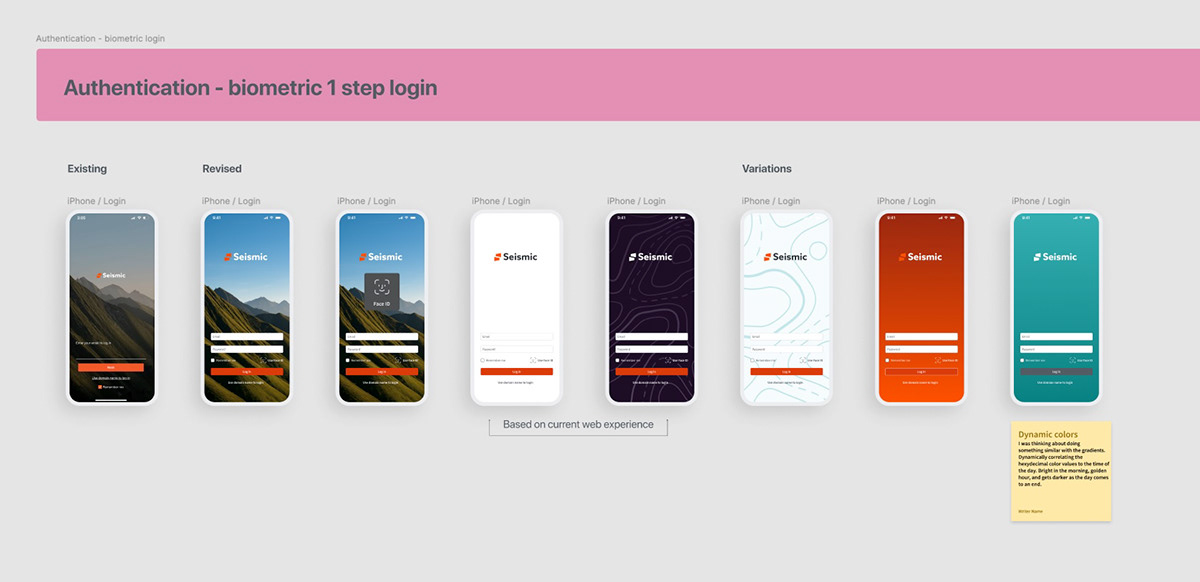
The audit flagged authentication as not available, and the day-in-the-life explained why that mattered: a seller with thirty seconds in a lobby will not type a password. I reduced sign-in to one step with Face ID, and treated the entry moment as brand as well as plumbing.
Designing Aura as one surface, not four features
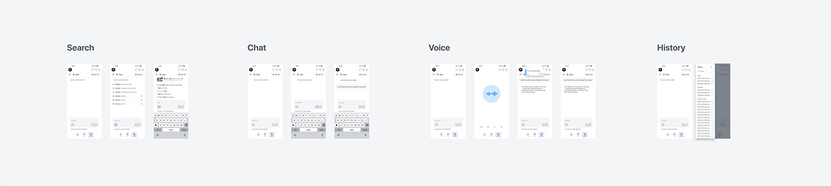
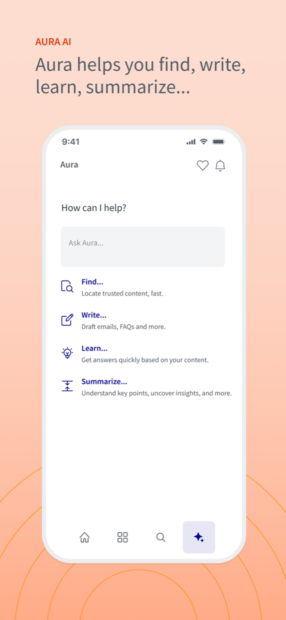
Chat, search, voice and history all answer the same question, help me with this account, so I designed them as one destination with four modes, not four entry points competing for the tab bar.
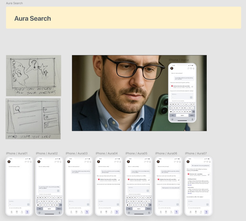
Search started on paper and resolved into a conversational flow that ends somewhere a document list never could: a meeting summary with the action items already extracted.
Voice, because the best minutes are hands-free
Voice is the direct answer to the commute insight: the seller opens Aura, taps into a full-screen listening state, and talks. When the session ends, the conversation is already in the thread as text they can scroll on arrival.
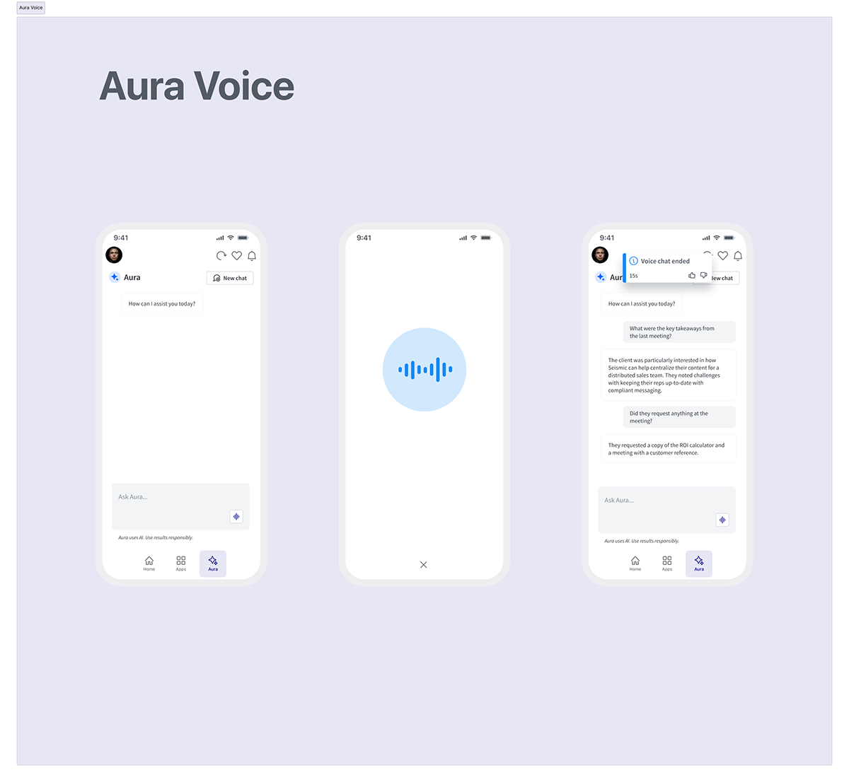
The listening state holds nothing but a waveform and a close control. Anything else is an invitation to look at the phone, and the whole point is that the seller is driving.
Podcast generation, because reading is not always possible
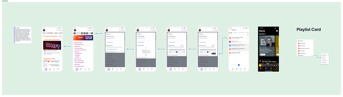
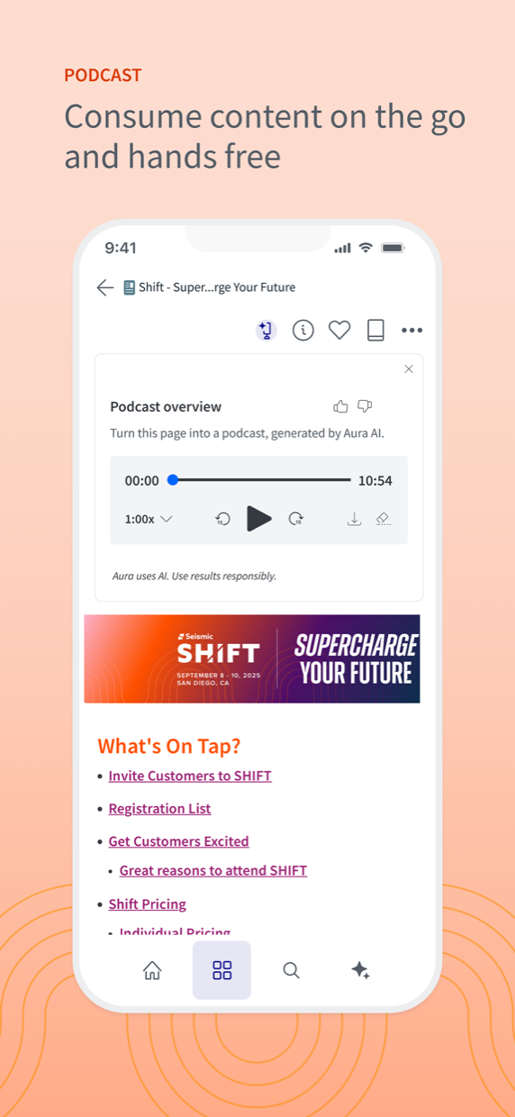
Podcast generation turns any page of enablement content into audio: the same insight as voice, pointed at the library instead of the assistant.
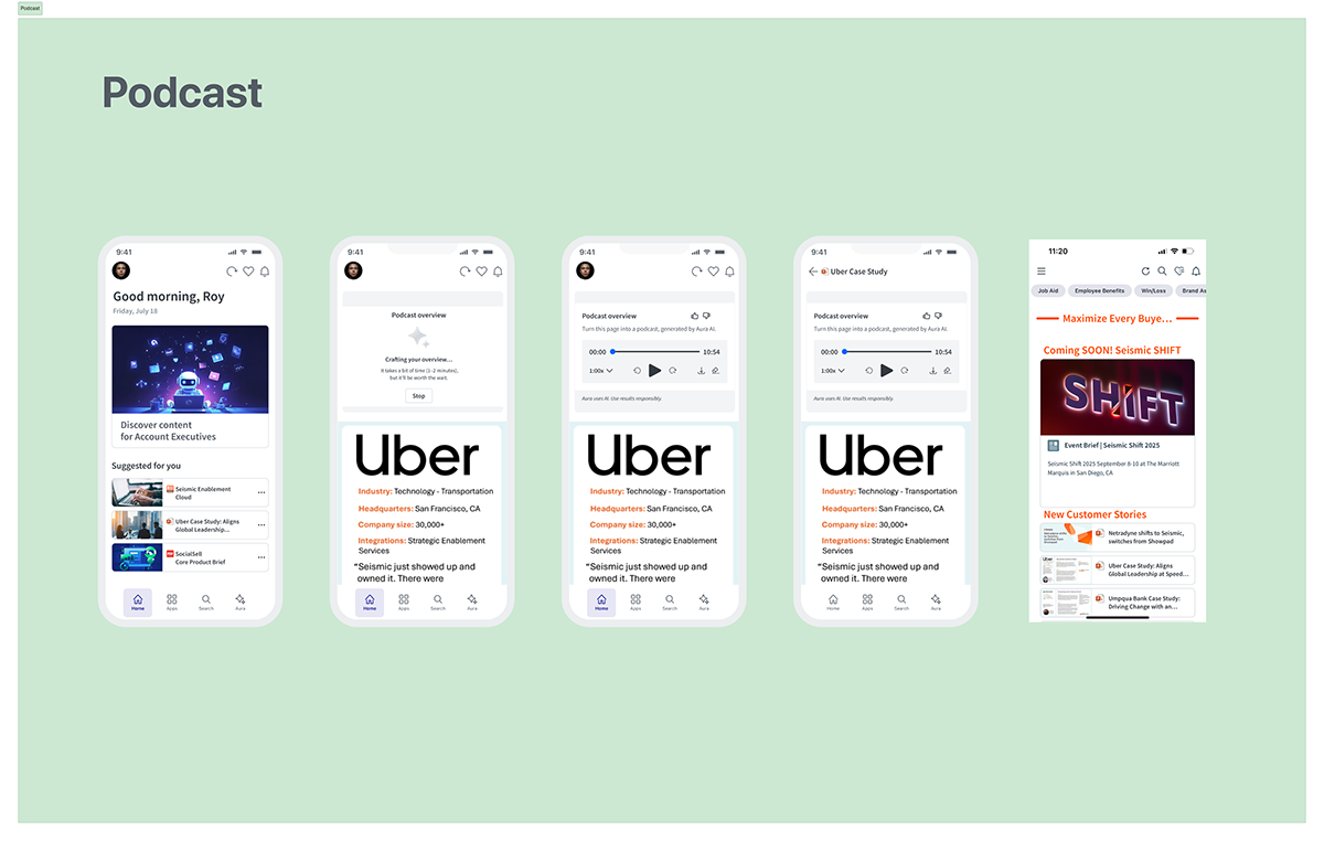
Two details carry most of the design thinking:
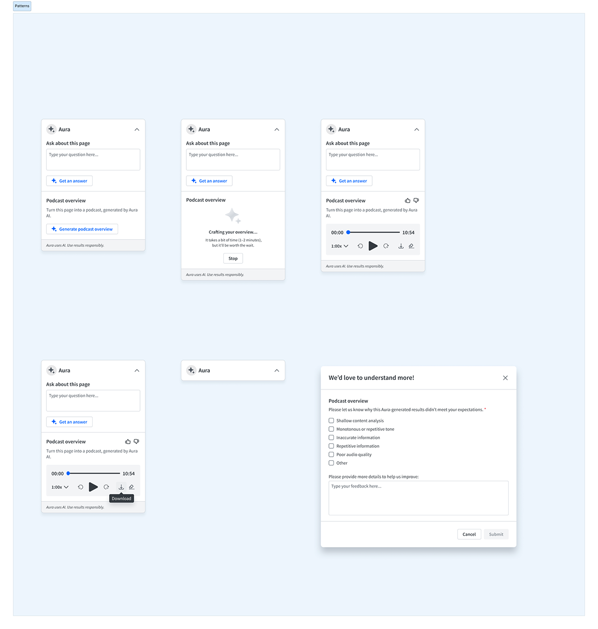
- The wait is named, not hidden. Generation takes one to two minutes, so the loading state says so out loud and offers a Stop. A spinner with no estimate reads as a hang.
- Disappointment has a designed path. Thumbs-down opens a structured form covering shallow analysis, monotonous tone, inaccurate, repetitive and poor audio, so a bad generation becomes labelled training signal instead of an uninstall.
Capturing the meeting, on whatever device is in the room
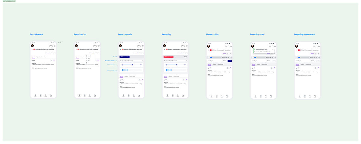
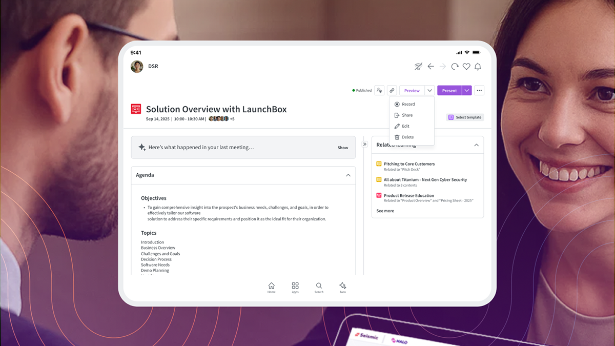
Recording was designed as a loop rather than a button: set up, record, review, and keep the recording attached to the engagement so it's still there next time.
Social: a before and after with a compliance problem attached
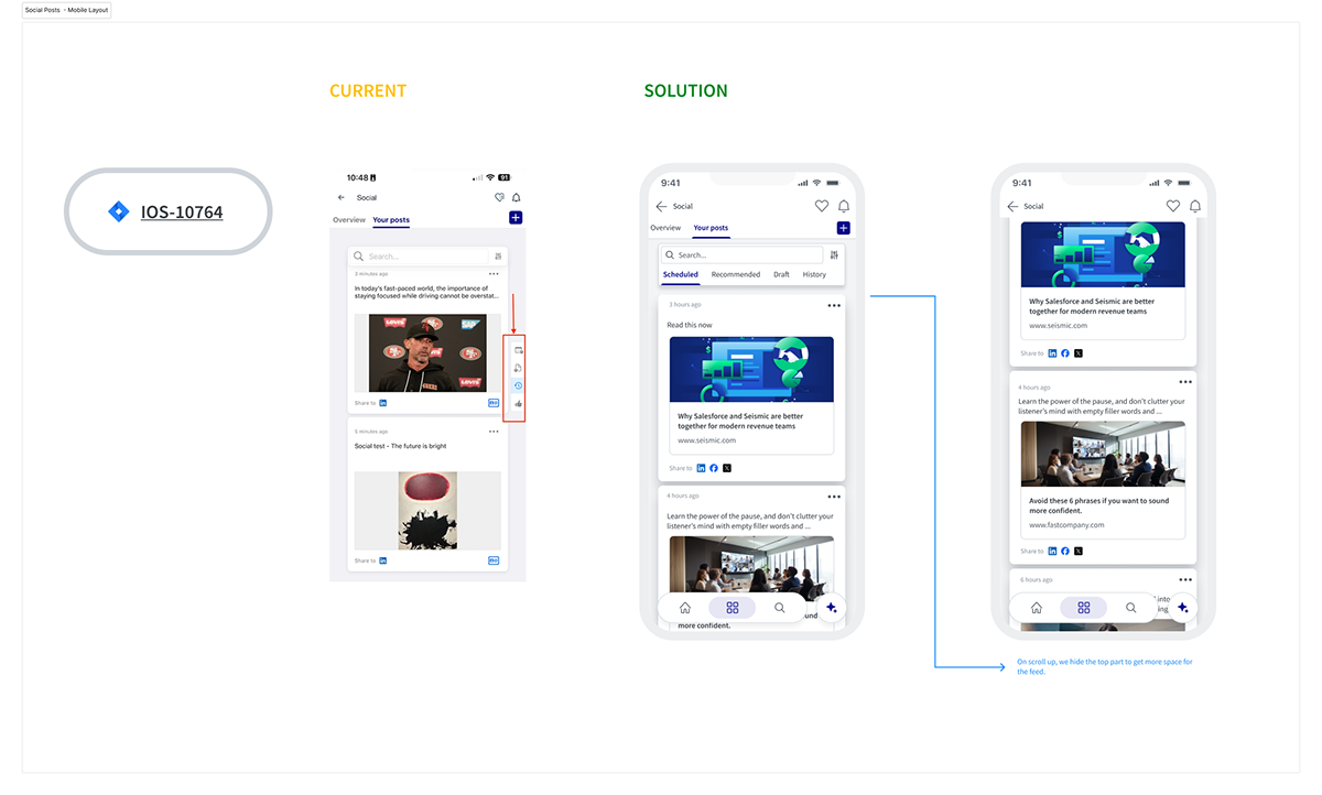
Social posting existed on mobile but was effectively unusable: a cramped icon rail, and a feed with no way to tell scheduled posts from drafts. The redesign replaced the rail with explicit tabs and gave the feed the screen.
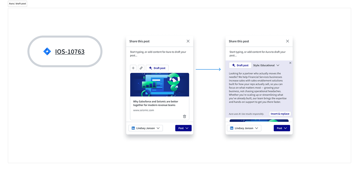
Aura then does the hardest part of social selling, which is starting. It drafts the post from the content being shared, in a selectable style, with insert-and-replace rather than an irreversible overwrite.
In regulated industries a seller cannot simply post: content must clear a compliance partner first, and it can fail in several ways, each needing its own designed state rather than a generic error.
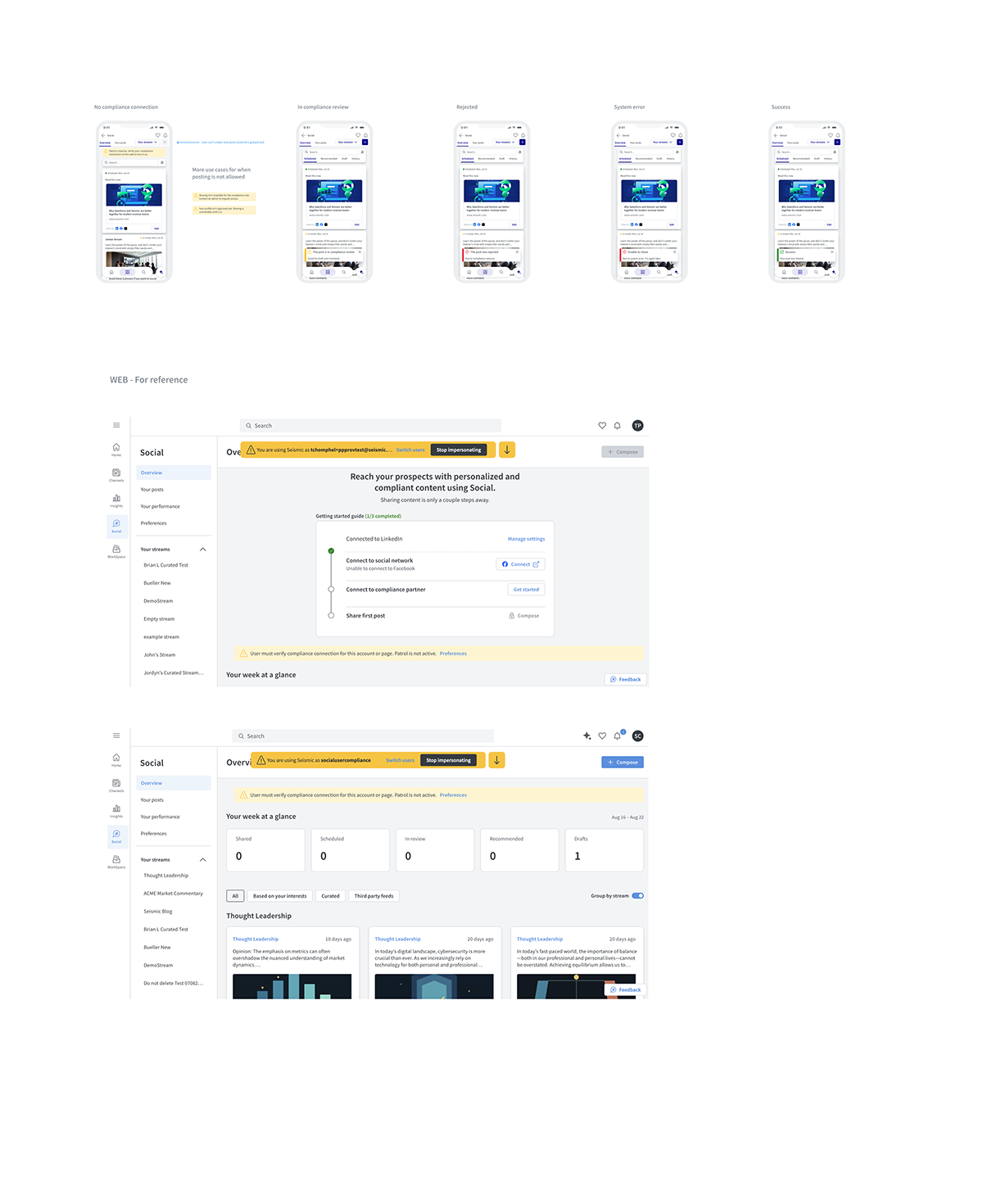
Telling a seller their post was rejected is easy. Telling them before they write it is the design problem worth solving.
Giving people a reason to come back
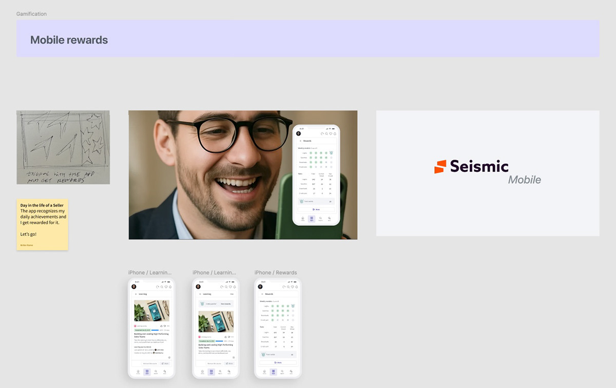
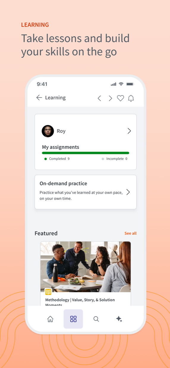
An app opened once a quarter never builds a habit. Rewards make the seller's own progress visible through streaks, assignments and points, so the loop closes on something other than a manager asking.
What shipped
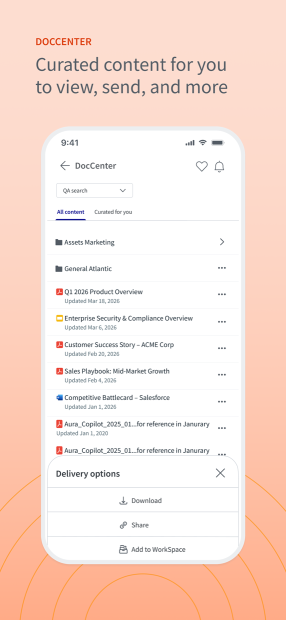
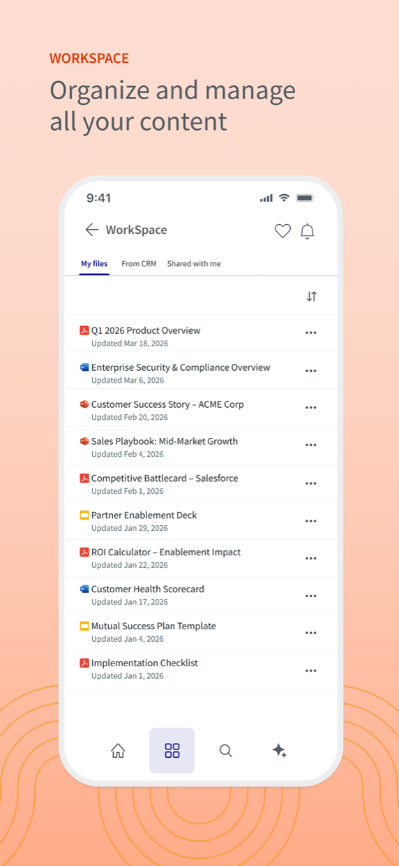
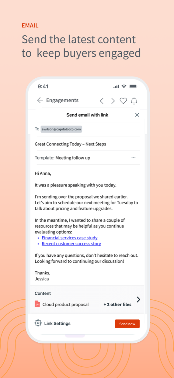
The surfaces that came out of the rebuild, as they were presented to customers:
Validating before GA
The redesign went to customers before it went to everyone. Fifty-seven joined the Fall release pilot, and at Shift 2025 47 of 101 survey respondents said they were interested in Seismic Mobile with Aura, for a surface most of them had stopped thinking about a year earlier.
The feedback was specific, and it was about the architecture, not the AI:
"I really like the bottom navigation and the redesigned user interface."
Bausch + Lomb
"Great job - the mobile app is way more user friendly with these new updates!"
Vensure Employer Services
That validated the hard call. We could have shipped a floating AI button in a fraction of the time and been praised for the AI. Instead they praised the navigation, the thing we spent the budget on, and the thing that made everything afterwards possible.
Results
Strategically, the work repositioned Mobile from a checkbox feature into a competitive surface, and the modernized architecture became the foundation the FY26 roadmap depends on. Aura Voice-to-Voice, omnipresent Aura Chat, digital sales rooms and bulk email on mobile all build on the stack laid down here.
The redesign didn't just add an assistant. It gave the assistant a product to live in.
What I'd do differently
- Instrument the assistant earlier. The thumbs-down form is the most useful thing on the podcast surface, and it arrived late. The failure path should have been designed alongside the happy path, not after it.
- Pilot earlier and smaller. Fifty-seven customers validated the release, but that landed close to shipping. A rougher build in front of ten customers three months sooner buys the same confidence with room to act on it.
- I underestimated what the architecture would carry. The navigational stack felt like overhead at the time and became the most reused artefact of the project, an argument I should have made up front rather than in hindsight.
The lesson is narrower than "AI needs good IA": when a product has stopped growing, the assistant is rarely the missing piece. The missing piece is a structure worth adding an assistant to. The 25% came from both, but only in that order.