Seismic · 2025
App Exchange & Integrations Platform
Seismic's integrations lived on five disconnected surfaces. I led the UX that turned them into one system — so sellers stop leaving their flow of work, partners can self-serve, and AI agents have something coherent to call.
Client
Seismic
Year
2025 · ~12 months
Role
Lead Product Designer, Integration Platform
Team
4 designers, product & engineering across 5 surfaces
Platform
Web · Salesforce & Dynamics · Slack · M365
Focus
Platform · Enterprise · Design Systems

In one line
Seismic connects to Salesforce, Microsoft 365, Slack, Zoom and 150+ other tools. In 2025 I led the design of the five surfaces that make those connections discoverable, buildable and usable — the public Exchange marketplace, the partner Developer Portal, the internal App Registry, the in-CRM seller experience, and Slack. Here is where that landed:
Context and the problem
Revenue teams don't work in one tool. An account executive moves between Salesforce, Outlook, Slack, Zoom and a content library in a single hour. Every context switch to go and find the right asset is a tax on the seller and a leak in the funnel.
Three forces were compounding at once:
- Tool fatigue. Sellers were asked to leave their work to fetch content, then carry it back by hand.
- A fragmented ecosystem. Integrations had been built opportunistically over years. Each had its own entry point, its own vocabulary, its own idea of what an "app" was.
- An AI deadline nobody had scoped. Agentic tooling was arriving, and our own audit put only 13% of public APIs at high agentic compatibility. Agents can't reason about an ecosystem that isn't legible.
Five surfaces, three owners, two external hosts, and no shared definition of the thing they were all describing.
The constraints were as real as the problem. The Developer Portal was hosted externally on ReadMe. Slack imposes its own UI framework and its own scarcity of space. The App Registry was a legacy internal tool. Analytics lived in Snowflake and Sisense, reachable only by asking someone. And the surfaces reported into different teams, so "just make them consistent" was an org problem wearing a design problem's clothes.
My role and what I owned
I was the lead product designer for the Integration Platform, setting the UX direction across all five surfaces and designing several of them directly.
- I owned the cross-surface strategy and the surface map that framed the work; the Exchange marketplace modernization; the Developer Portal redesign; the App Registry analytics specification; the CRM Contact Picker and Advanced Search flows; the Connect-with-CRM and delegation states; and the Slack Home Tab.
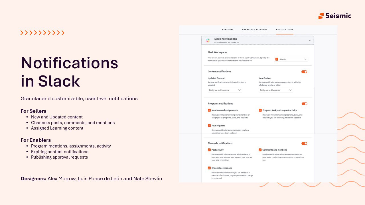
- I shared Slack Notifications with Alex Morrow and Nate Shevlin, and set the Slack design standards the wider group built against.
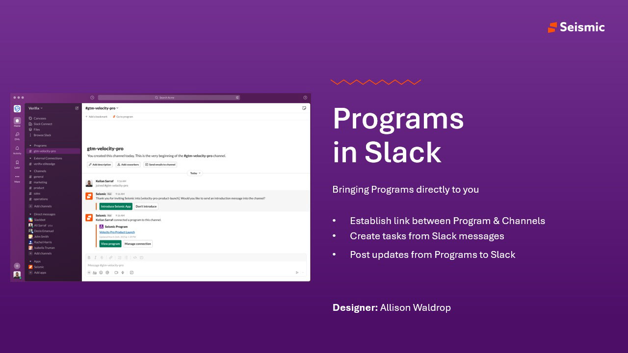
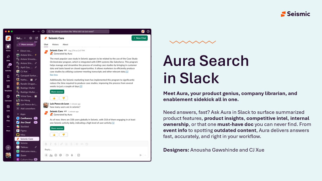
- Teammates owned Programs in Slack (Allison Waldrop) and Aura Search in Slack (Anousha Gawshinde and CJ Xue), working from the shared patterns and Block Kit direction.
- Engineering and product owned the API surface itself, the agentic compatibility work, and the Snowflake data pipeline behind the dashboards I specified.
This was not a redesign of one product. It was five parallel tracks that had to arrive at the same place. Most of my job was deciding what had to be identical across them, and what was allowed to differ.
Goals, and how we'd know
We set the bar before designing, because "improve integrations" isn't measurable:
- Let customers find and install integrations without a sales conversation. Measured by apps created and by Exchange traffic converting to installs.
- Let partners ship an integration without talking to us. Measured by self-serve app registrations and support ticket volume.
- Increase action taken inside the tools sellers already use. Measured per surface: CRM, Slack, M365 Copilot, mobile.
- Make the platform agent-ready. Measured by the share of public APIs rated high for agentic compatibility.
There was a problem with all four: we could not actually measure any of them. Usage data existed in Snowflake but no one outside the data team could reach it, and no partner could see how their own app was performing. So the first design deliverable wasn't a marketplace. It was instrumentation.
Research, and the three things that changed direction
1. It wasn't five products. It was one journey with five addresses.
I started by mapping every surface a customer, partner or seller could touch, and who owned it. Laying them on one page was the moment the real problem became visible.
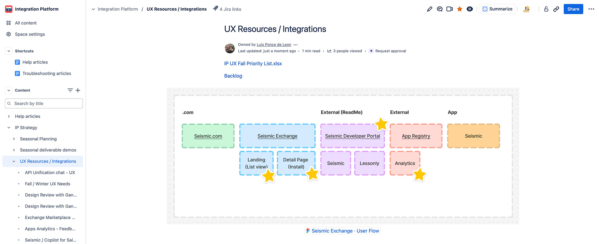
A partner building an integration had to cross four of those columns, two of which we didn't host, and each of which called the same object something different. The fix wasn't five redesigns. It was one vocabulary — app, listing, integration — defined once and enforced everywhere.
2. In Slack, we were designing for the wrong unit of work.
Studying how sellers actually used Slack produced three shifts that reframed the whole surface:
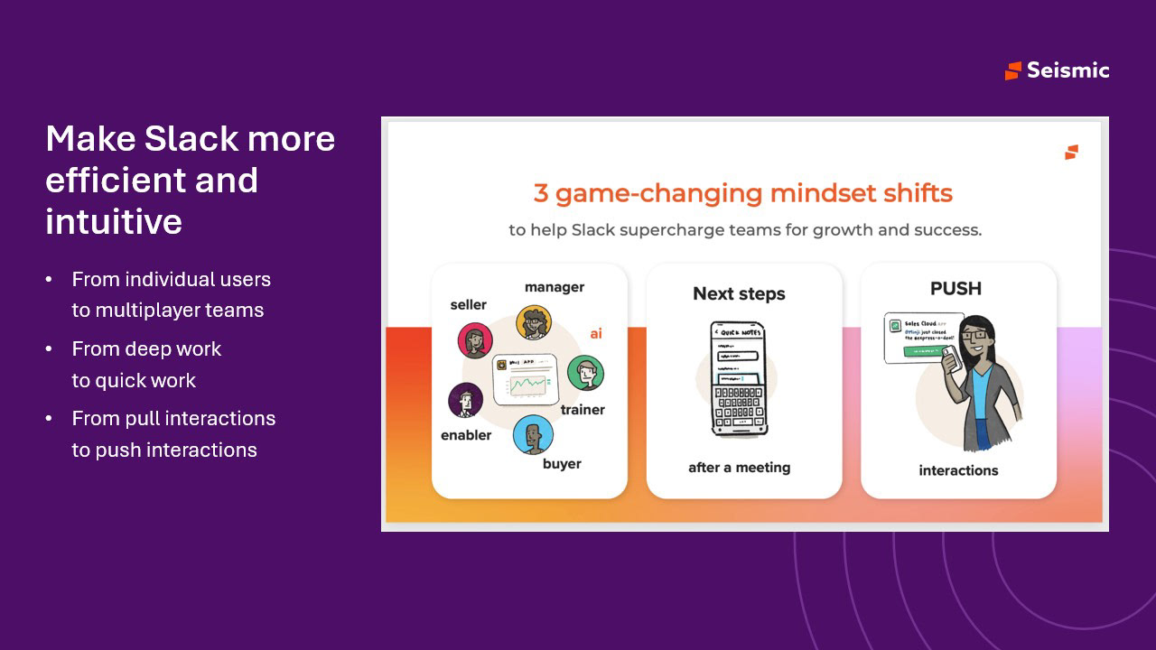
The third shift was the expensive one. We had been building Slack as a place to go and search — a small version of the web app. But the value of Slack is that it comes to you. That killed the search-first concept and made notifications, not search, the centre of the surface.
3. A third of users were silently disconnected.
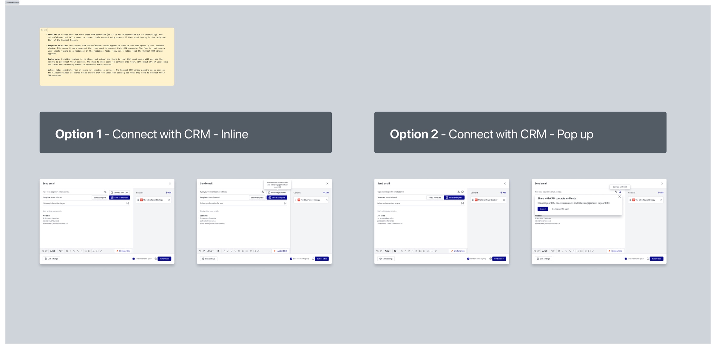
In CRM, the prompt telling a seller to connect their account only appeared once they had already started typing a recipient. The data confirmed the cost: about 30% of users had not taken the action to reconnect after an inactivity disconnect. They weren't refusing. They never saw the prompt.
The feature existed, worked, and shipped. It just fired at a moment when nobody was looking at it.
Strategy and the decisions that mattered
Decision 1 — Measure first, redesign second
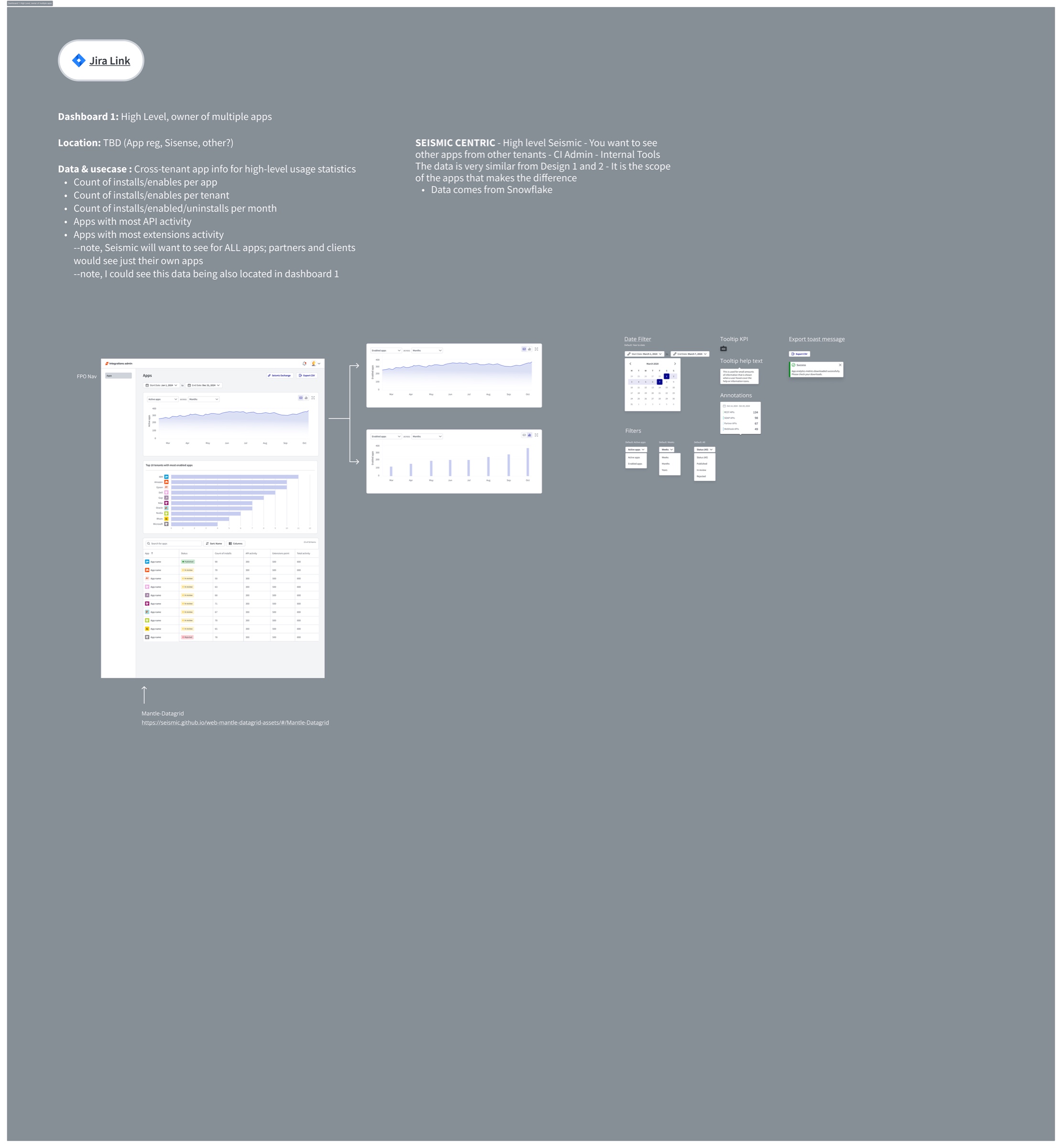
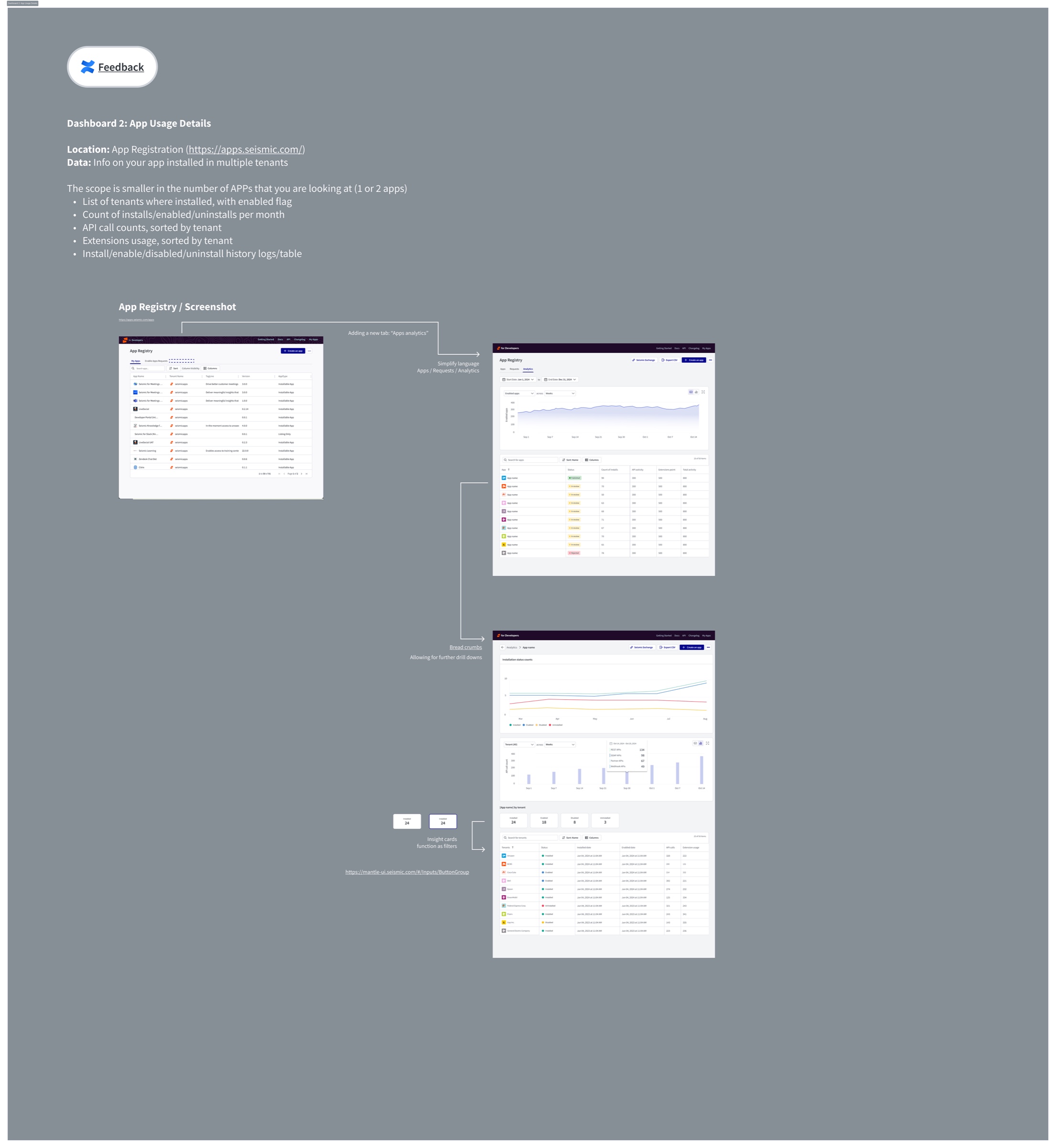
Rebuilding the marketplace before we could see app-level usage would have meant shipping on opinion. So I specified two analytics surfaces before touching the storefront: a cross-tenant view for Seismic, and a per-app view partners could see themselves.
Decision 2 — Use the host's design system, not ours
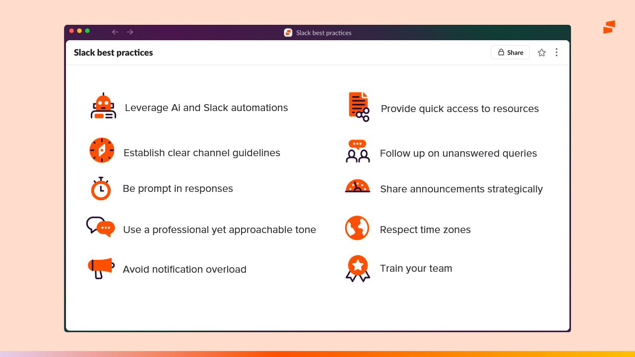
The instinct inside an enterprise company is to make every surface look like the enterprise. I argued the opposite for Slack: an app that ignores Slack's conventions reads as a foreign object in the one place where familiarity is the entire value proposition.
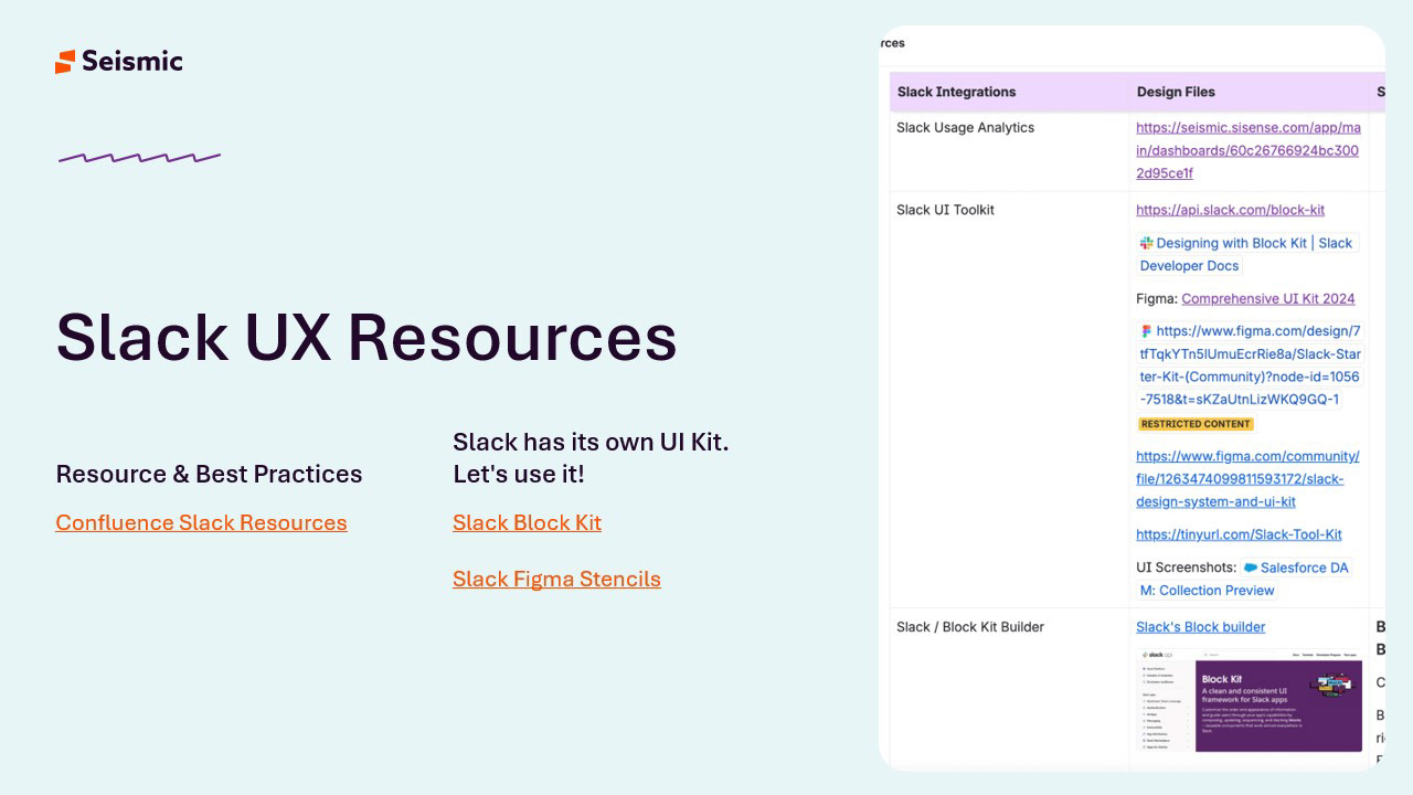
This was the decision with the most friction. It meant accepting constraints we didn't control and giving up some brand expression. The payoff was that our Slack surface stopped looking like a port, and the four designers working on it converged without a weekly review.
Decision 3 — Design for the agent as a user
With only 13% of public APIs rated highly agent-compatible, "AI-ready" was a platform property, not a feature. In the Registry that meant treating an MCP connector as a first-class app with the same registration, permissioning and activity trail as any other.
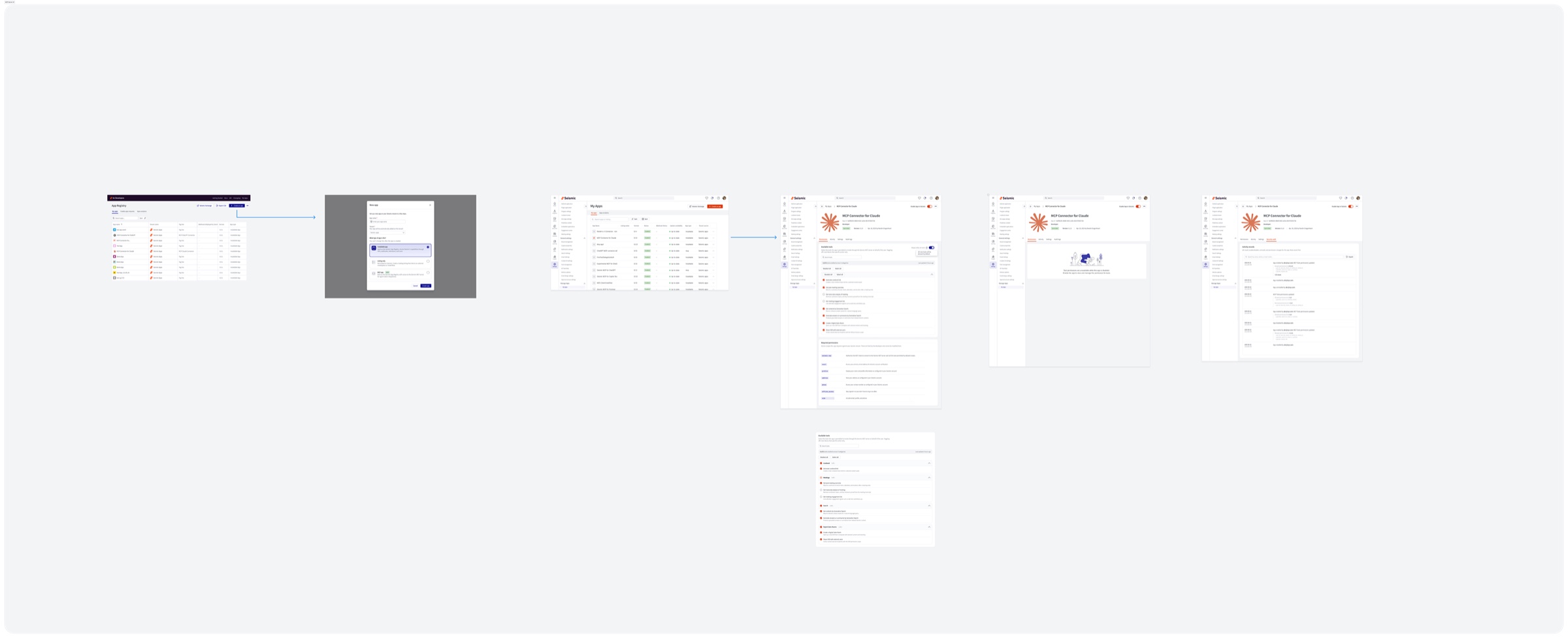
The solution, surface by surface
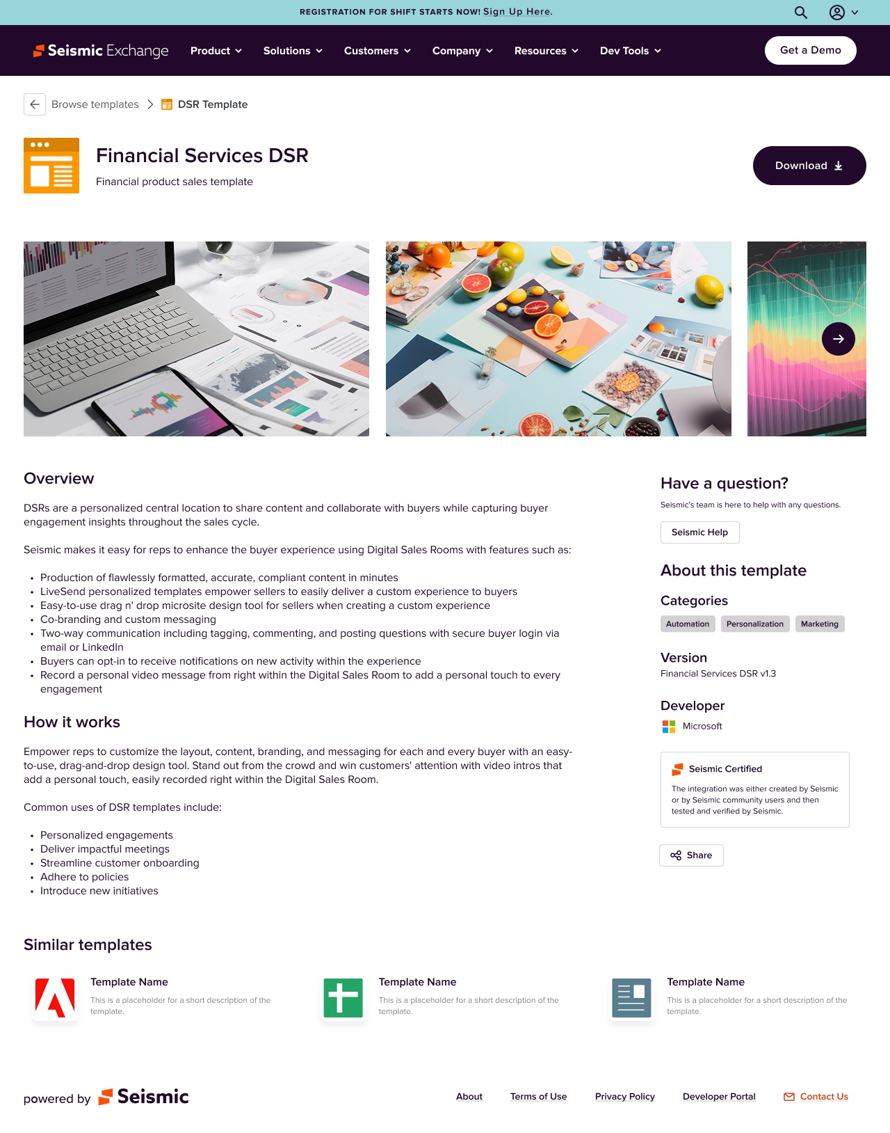
Exchange — a marketplace you can shop without us
The old path to an integration ran through a salesperson. The modernized Exchange lets a customer browse by outcome, evaluate against categories, and install.
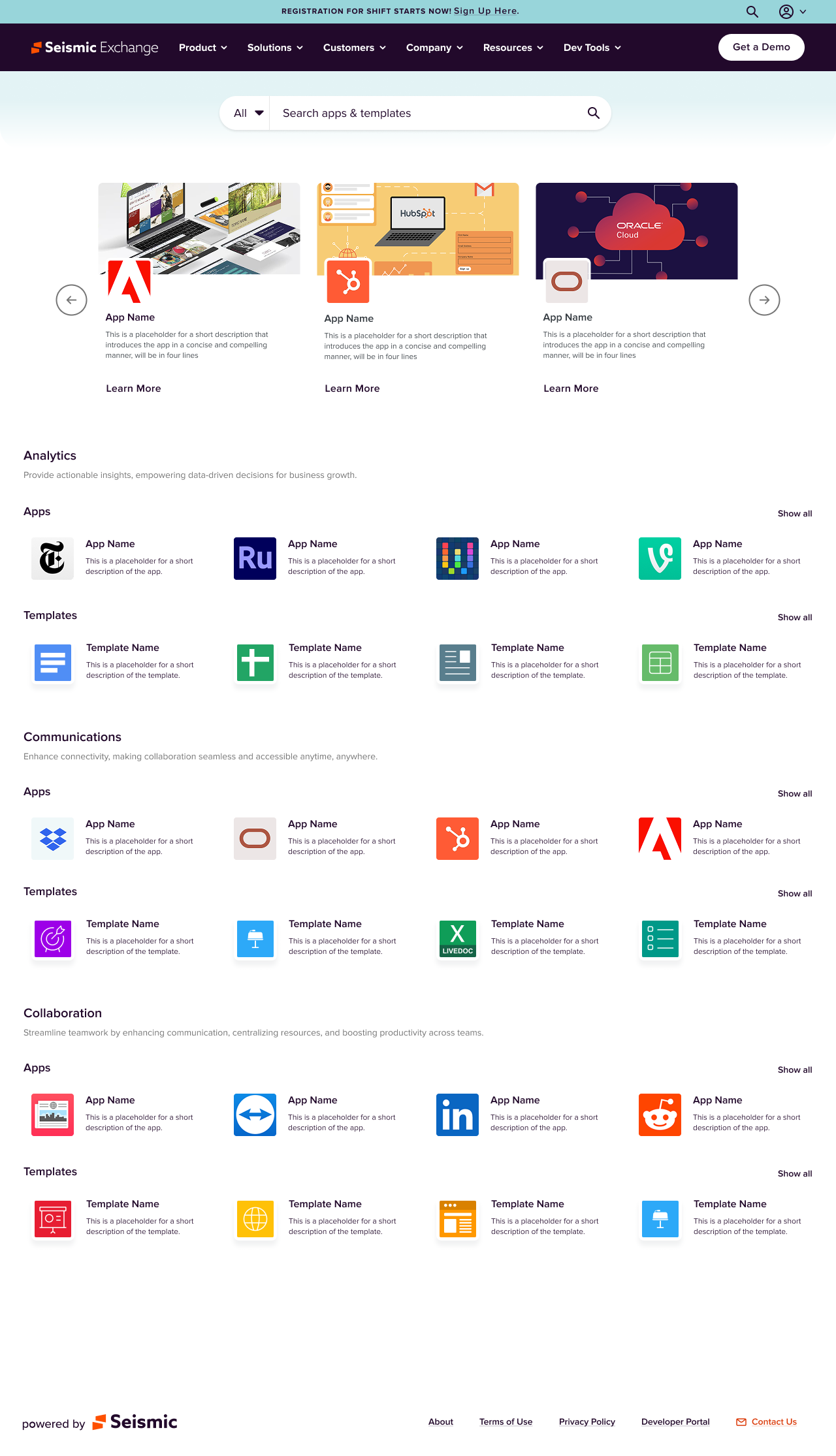
Developer Portal — a partner's path from curious to shipping
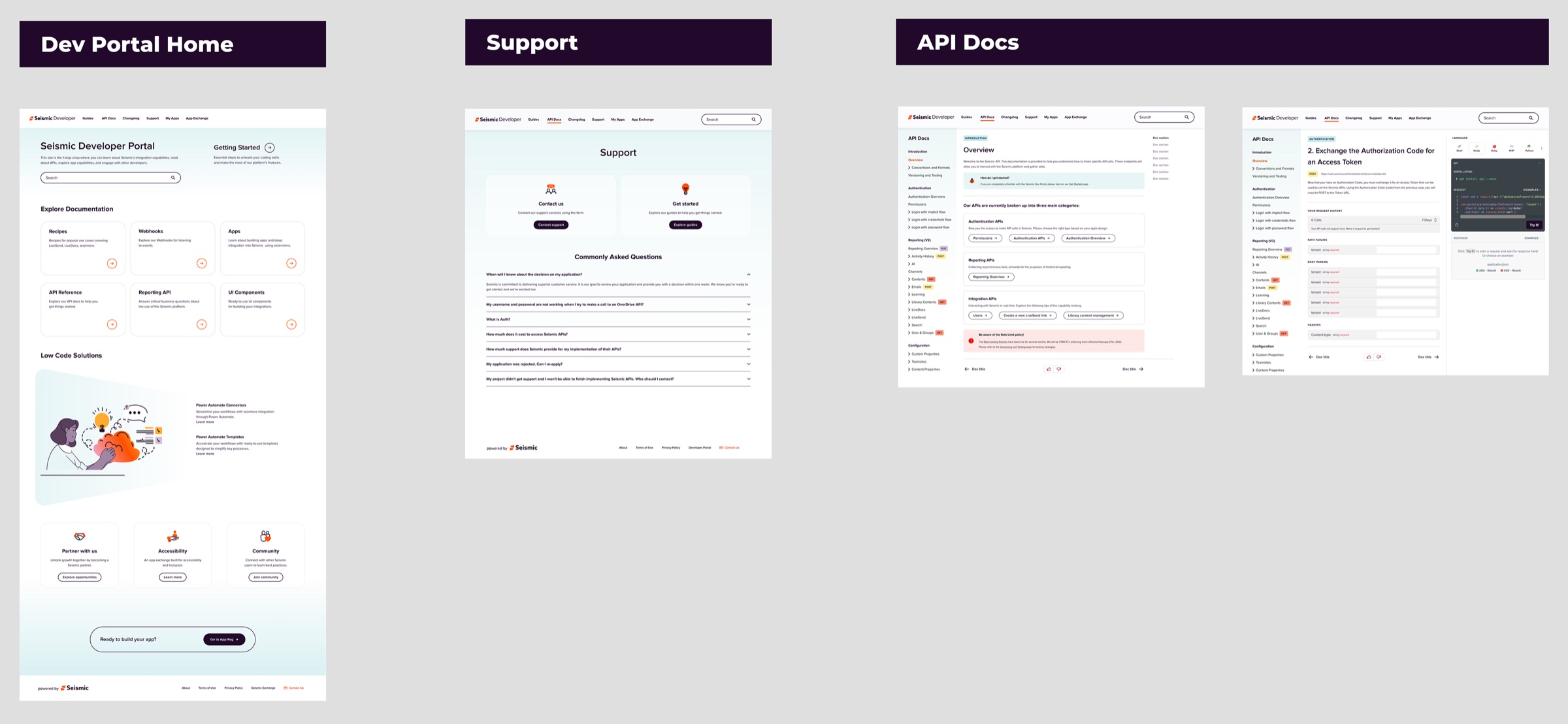
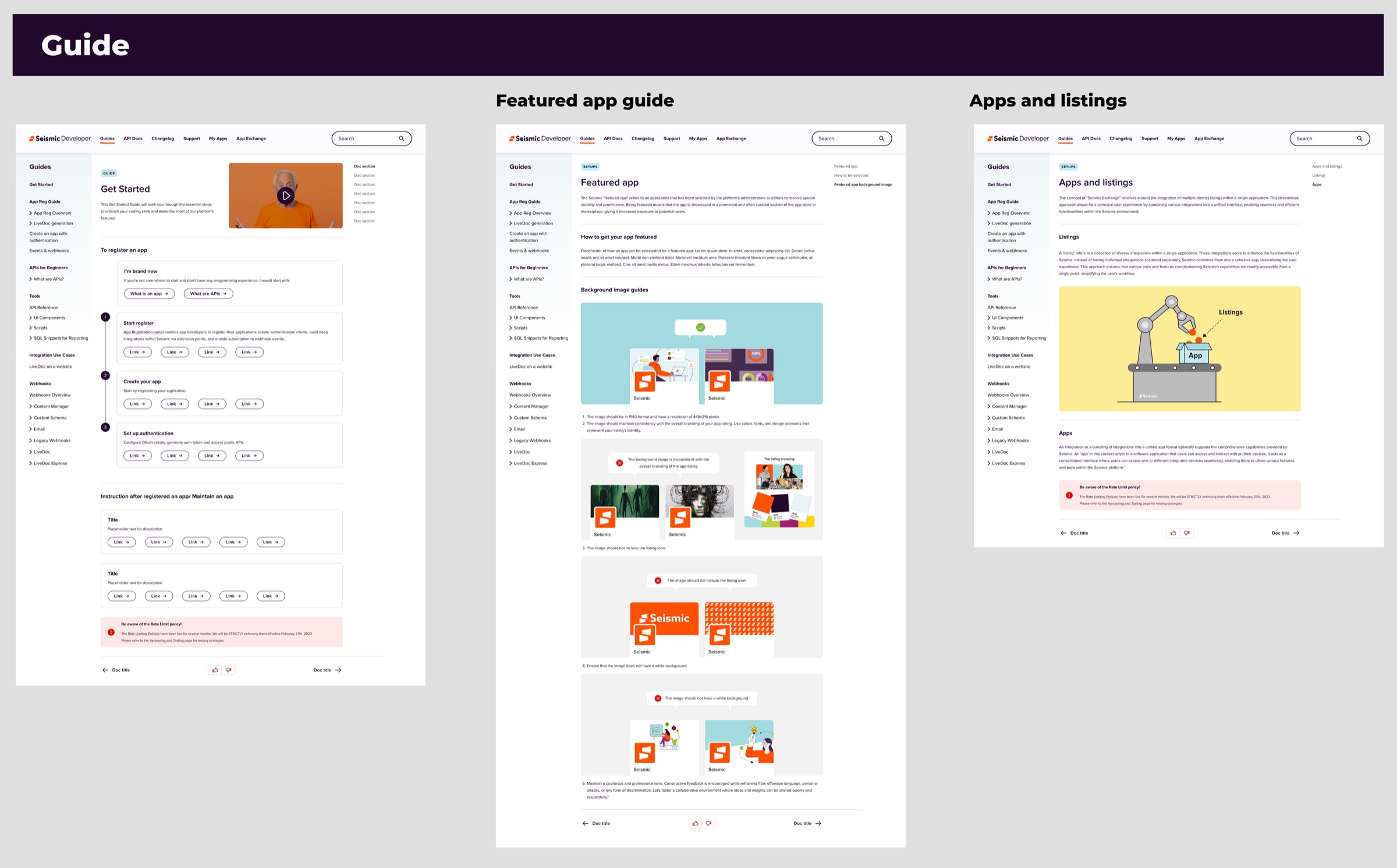
The portal had documentation but no route through it. I restructured it around the sequence a developer actually follows.
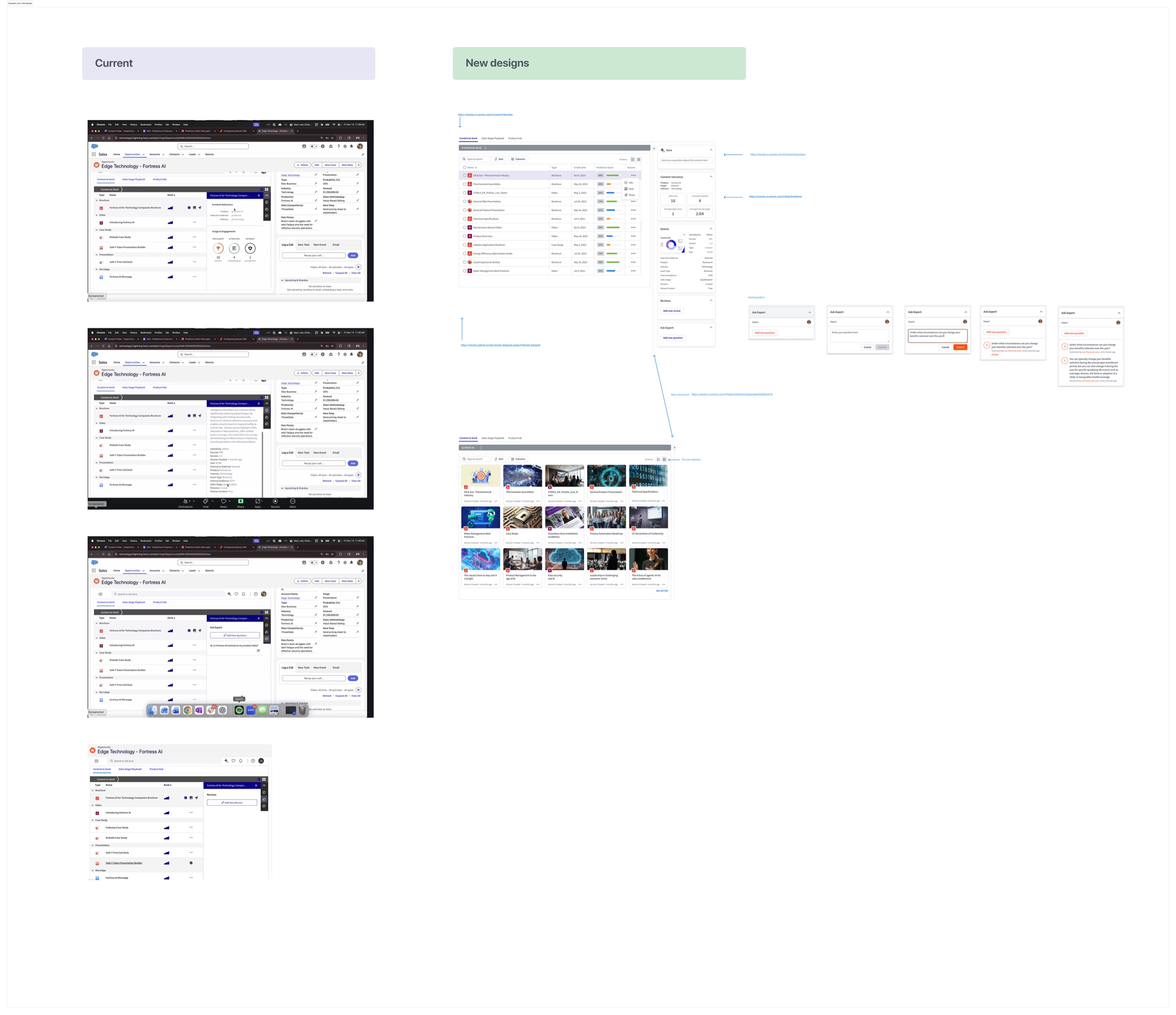
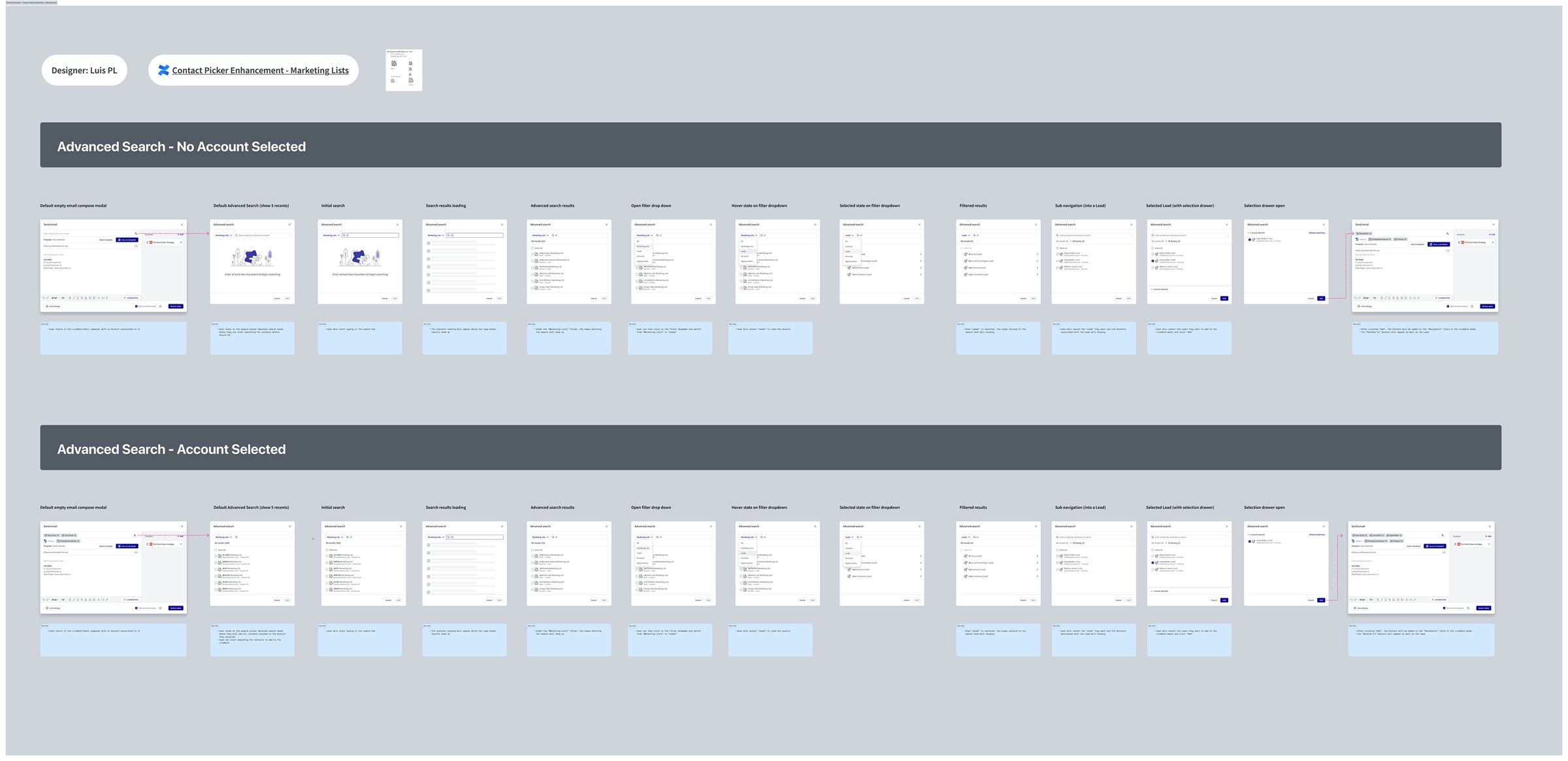
CRM — the surface where sellers actually spend the day
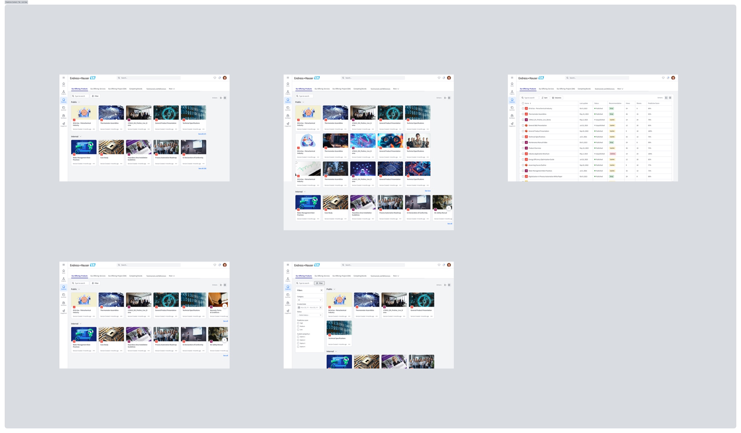
Most seller time is inside Salesforce and Dynamics, so this is where a saved click compounds. I worked on two threads: making the right content obvious, and removing the connection failures that quietly blocked everything else.
Slack — bringing the work to the seller
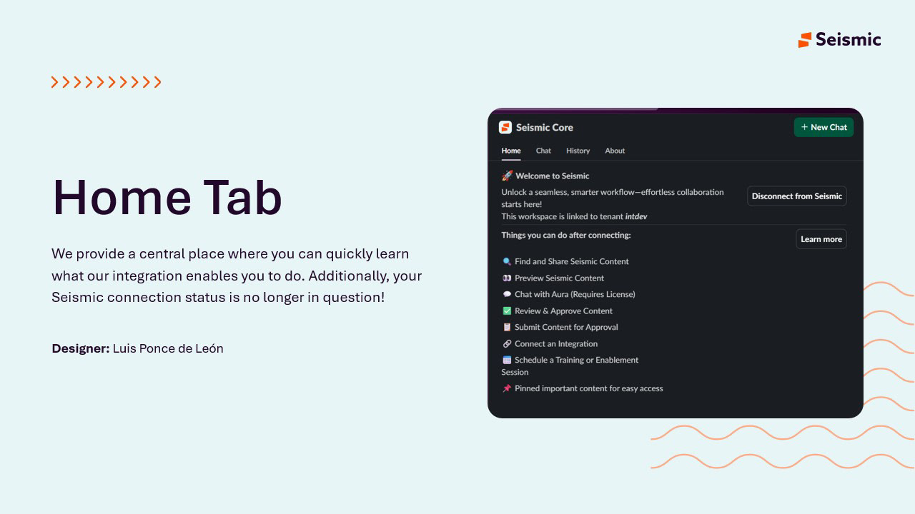
Following the push-not-pull insight, the Slack surface is built around arrival: it tells you what it can do, then brings you things.
Validation and iteration
We thought the reconnect prompt worked. It didn't. So we moved it.
The clearest loop in the project. We thought the existing Connect-with-CRM notice was adequate — it shipped, it functioned. We learned it only appeared after a seller began typing a recipient, and roughly 30% of disconnected users never reconnected. So we did two things: moved the prompt to the moment the compose window opens, and prototyped both ways of delivering it before choosing.
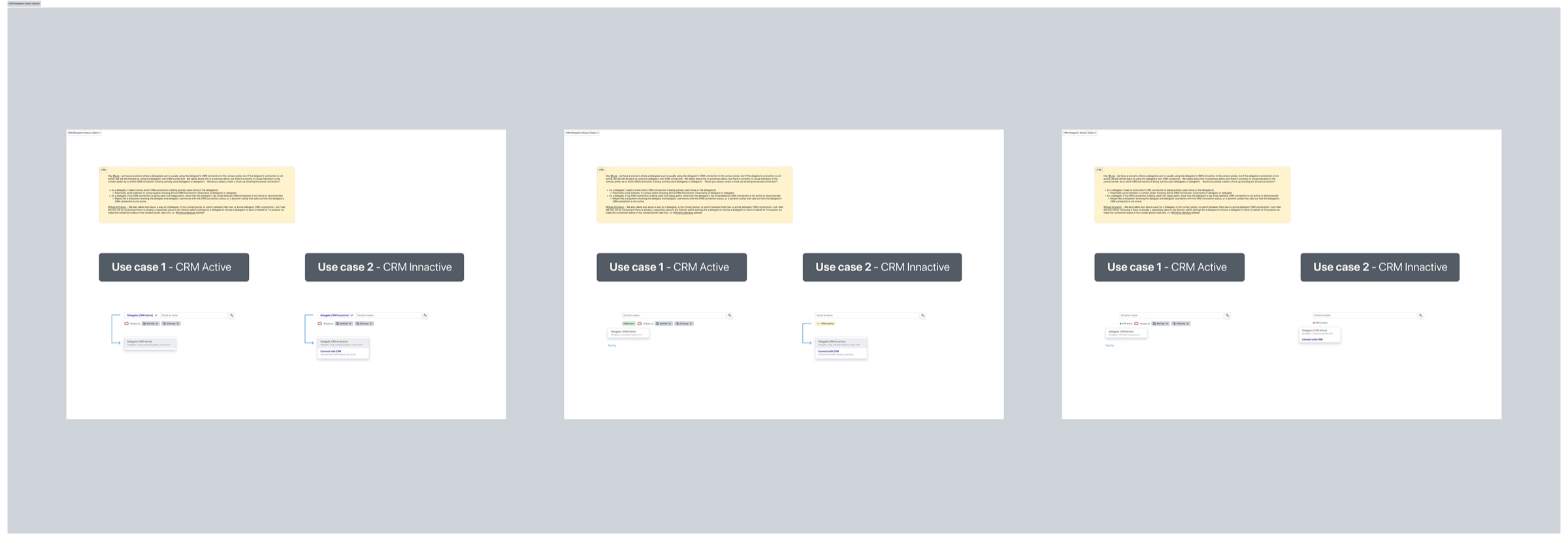
The same audit surfaced a harder case underneath it: delegates. When one person sends on behalf of another, whose CRM connection matters? I worked the active and inactive states across three options rather than guessing.
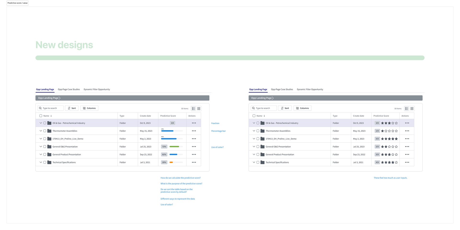
Killing a visualization we liked
Predictive score needed a representation. I put fractions, percentage bars and star ratings in front of reviewers together.
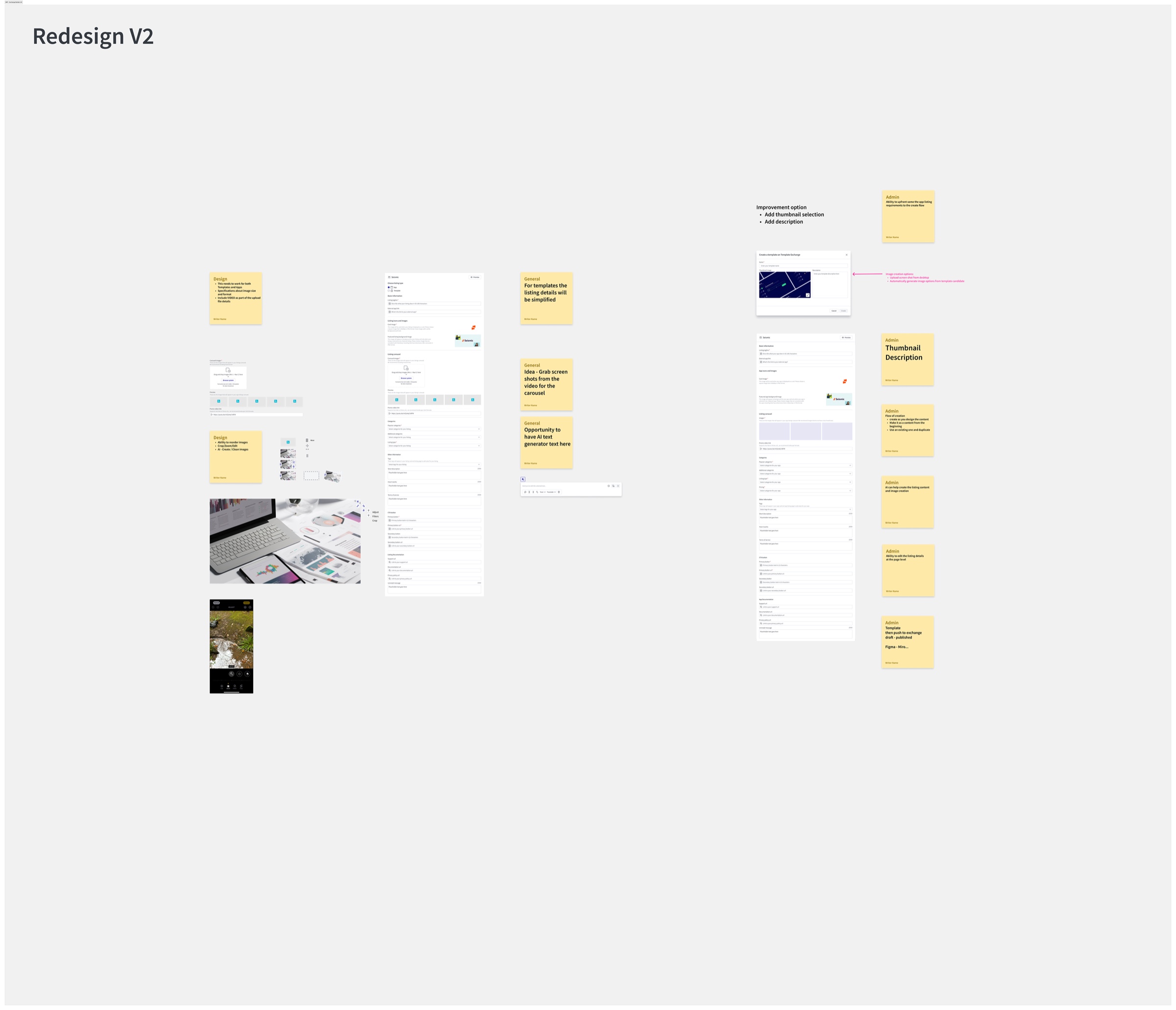
Listing creation, second pass
Outcome and impact
The instrumentation we built first is what makes this section possible at all. These are the platform's 2025 numbers, end to end:
2025 in review
Seismic Integration PlatformPlatform
Surface areas
Source: Seismic Integration Platform annual review, 2025.
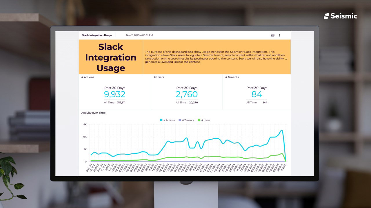
Two of those deserve a note. Apps created up 76% is the self-serve goal paying out: partners and customers building without a conversation. Slack up 141% is the push-not-pull decision paying out, and the surface dashboard shows it wasn't a spike — actions climbed from a 2021 baseline to 9,932 in a single 30-day window, against 317,611 all time across 144 tenants.
The platform numbers are the unglamorous half, and they are the ones that decide whether an ecosystem stays coherent as it grows: standardized permissions, a consistent org hierarchy, and a repeatable path for creating and upgrading a tenant.
Treating integrations as a designed platform rather than a list of connectors did two things at once: it removed friction from the seller's day, and it turned every partner into a distribution channel.
What I'd do differently
- Define the vocabulary in week one, not month three. App, listing, integration and template meant different things on different surfaces, and we discovered it through rework. A single glossary agreed across the five teams would have been the cheapest artefact of the project and I produced it late.
- Instrument even earlier. Building the dashboards before the storefront was right, but I still spent the first weeks arguing from intuition because the data wasn't reachable. If usage isn't visible, the first design problem is always visibility.
- Take the host's design system decision to the group sooner. I made the Block Kit call after two designers had already invested in Seismic-styled Slack concepts. The reasoning held, but the cost was theirs, not mine.
- Push harder on agentic compatibility as a design constraint. We treated 13% as an engineering metric. It's also a design one — naming, structure and permission models are what make an API legible to an agent, and I engaged with that later than I should have.
The broader lesson is about where leverage sits in platform work. The marketplace was the visible deliverable, but the things that actually moved the numbers were a shared vocabulary, a measurement surface, and a decision to stop imposing our design system where it didn't belong. None of those photograph well. All three are why the rest worked.